Feline Health
Responsive redesign of a cat-only veterinary clinic website, introducing online booking and elevating usability and brand personality.
problem
The website didn't reflect the clinic's vibrant personality or the warm, one-doctor care that makes it special. The design was clunky, with missing information and dated navigation. It failed to capture the playful space—defined by neon signs and cat wallpaper—or the bond Dr. Blair builds with her patients and their owners (she's also my vet, whom I trust).
solution
The site should convey the clinic's energy and personal touch while simplifying the experience for cat owners. Clearer navigation, online booking, and design details echoing the neon-and-wallpaper aesthetic would create a trusted digital extension of Dr. Blair's care—approachable, intuitive, and connect with.
project
Responsive Site
Redesign
role
UX Researcher
UI Designer
duration
8 Weeks
tools
Figma
Photoshop
Research
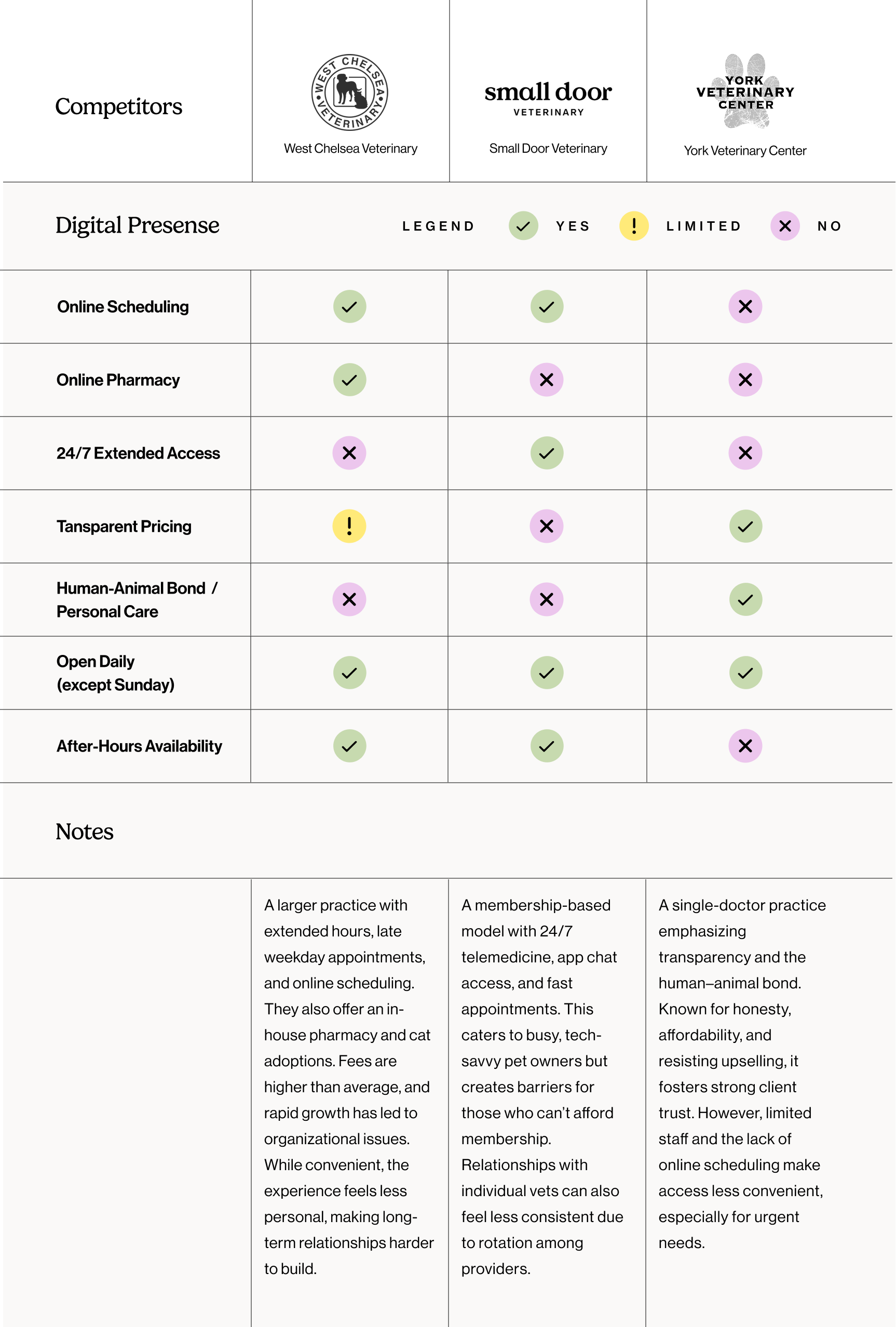
I kicked off research with a competitive analysis of local veterinary websites to see where Feline Health fit. Larger practices emphasized convenience and extended services, membership-based clinics leaned into tech-driven access, and smaller practices built trust through transparency and personal care. What stood out was the unique strength of Feline Health as a one-doctor practice—personal, consistent, and trusted. The opportunity was to bring that same warmth online while adding modern usability features like online booking.
competitive analysis
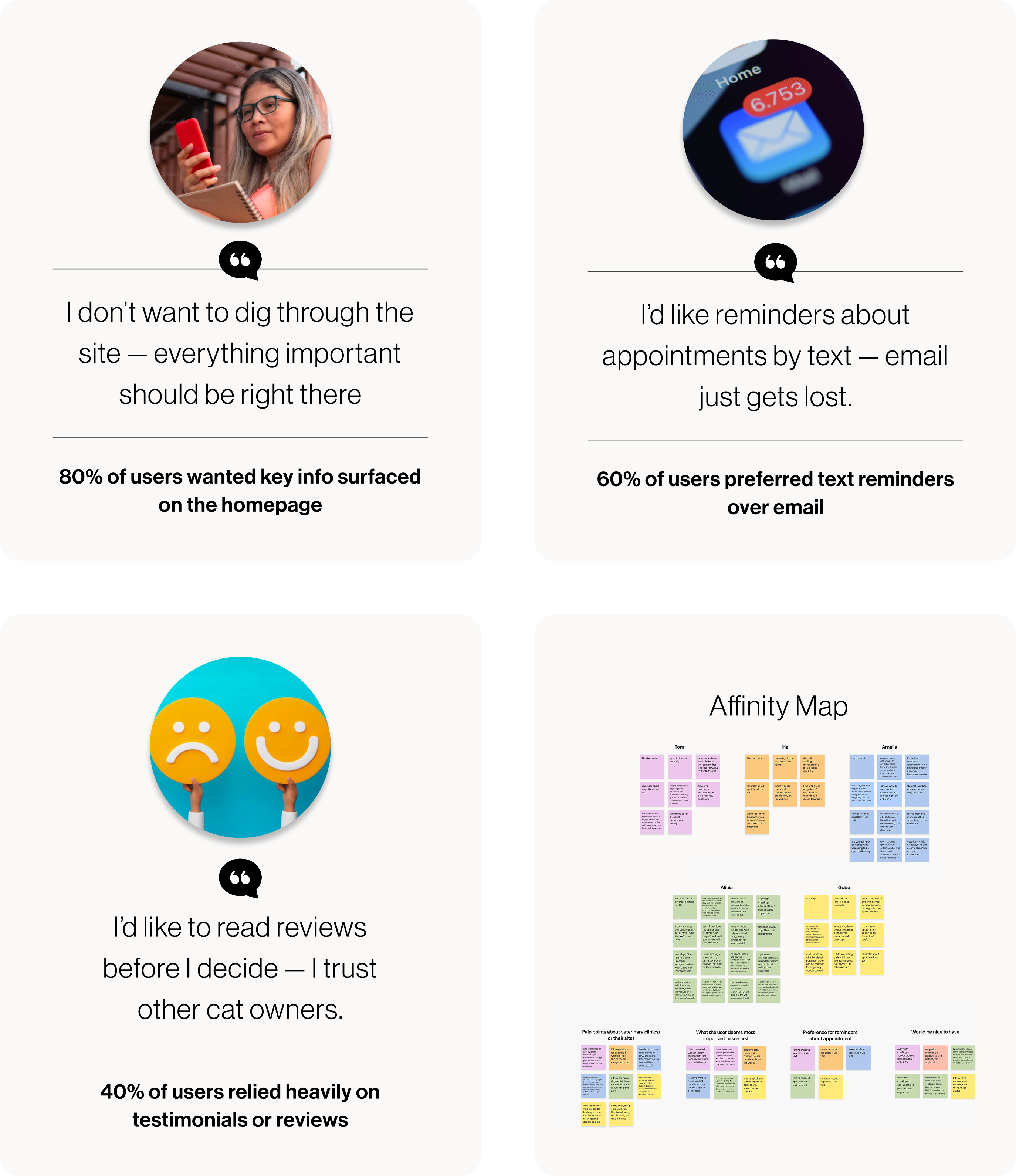
To understand user motivations and pain points around veterinary care, I conducted five interviews and organized feedback into an affinity map. Clear patterns emerged: users wanted clinic details upfront, preferred text reminders for appointments, and valued transparency from a one-doctor practice—insights that directly shaped design priorities.
affinity mapping
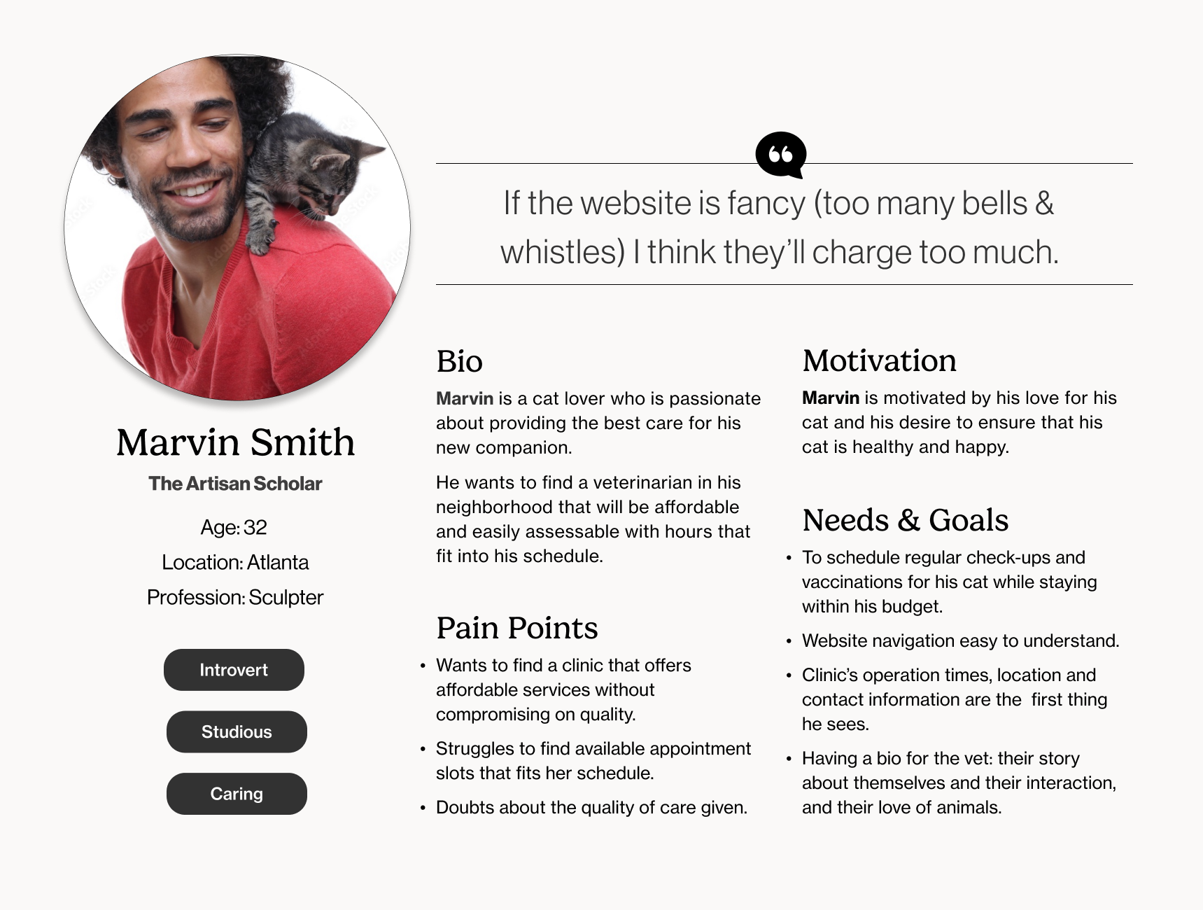
Marvin embodies a rising group of conscientious pet owners who prioritize both quality veterinary care and cost-effectiveness, underscoring the demand for clear, accessible services that offer professional care at affordable prices, free from hidden fees or unnecessary complexity.
persona
Define
From my research, I identified several areas for improvement that needed to be addressed:
1
Stronger Branding
Refresh the logo and overall visual identity so the site feels cohesive and immediately recognizable, while reflecting the playful, welcoming personality of Feline Health.
2
Clear, Simple Navigation
Make key details like hours, location, and contact information easy to find at a glance, creating a smoother experience for cat owners seeking quick answers.
3
Bring the Space Online
Translate the one-doctor practice's warmth and the lively interiors—neon signs, cat wallpaper, and a sense of community—into the website, so visiting online feels like walking through the clinic's doors.
Ideate
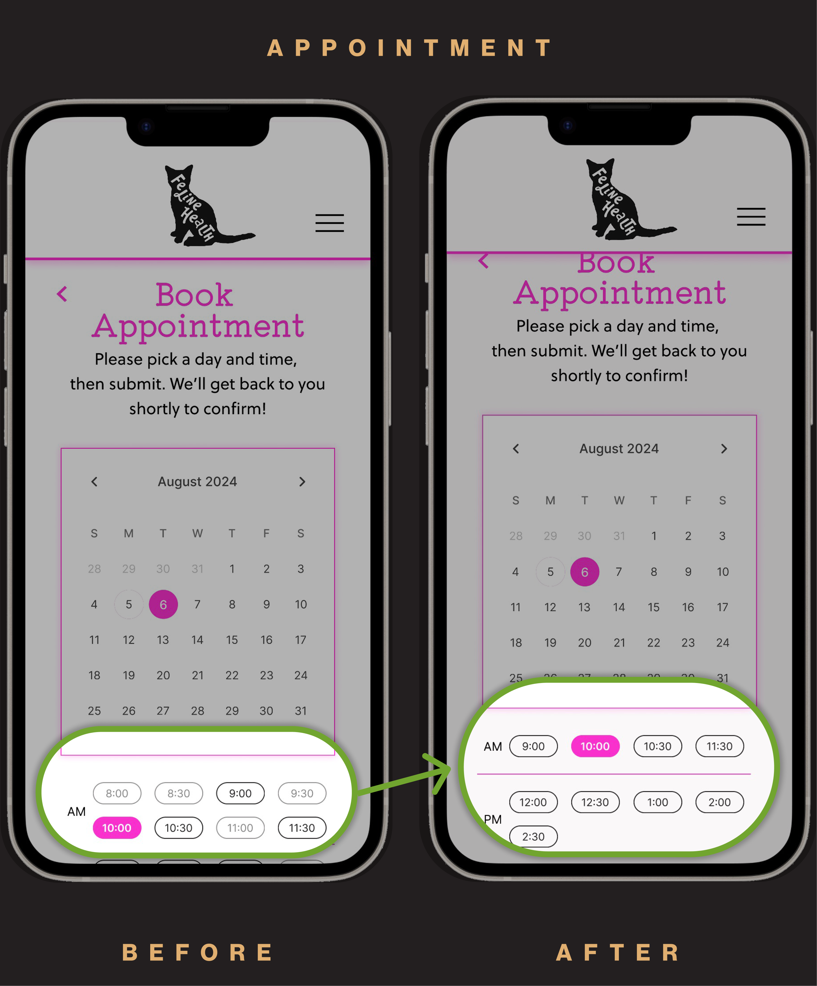
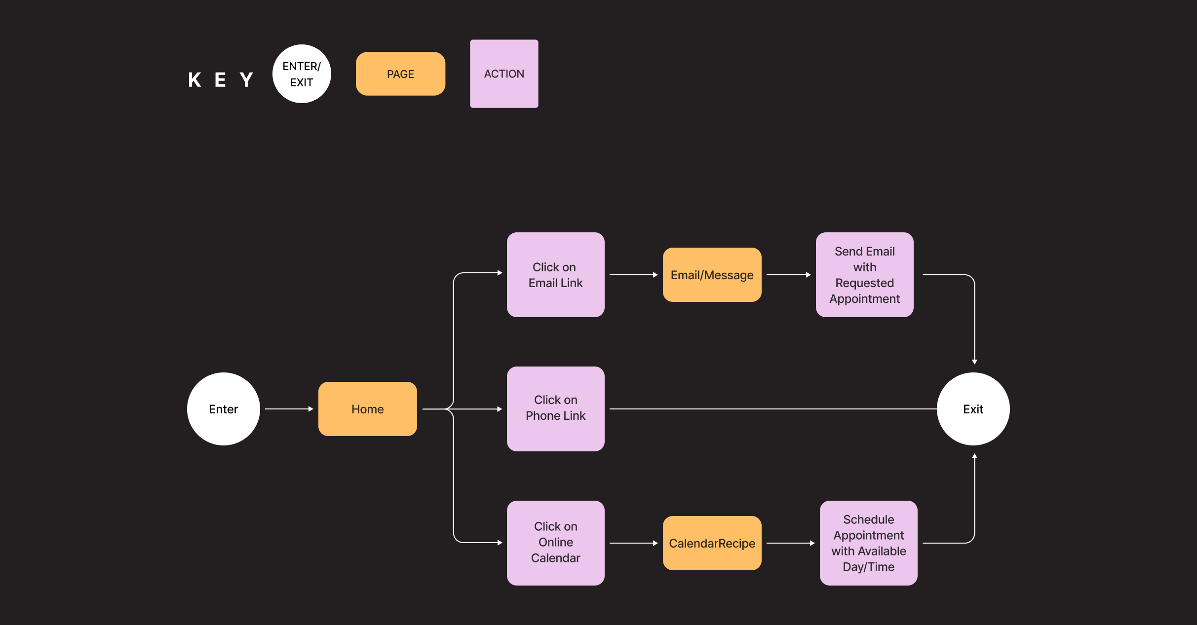
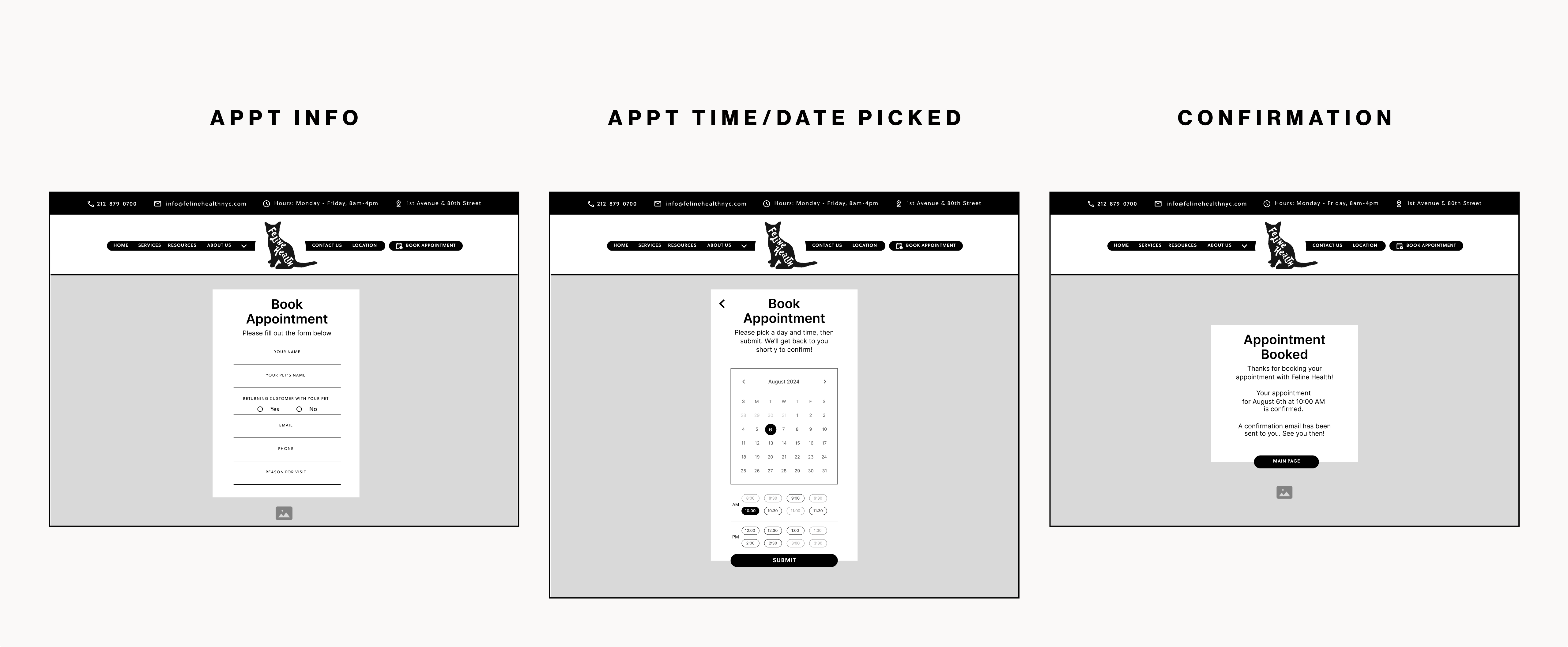
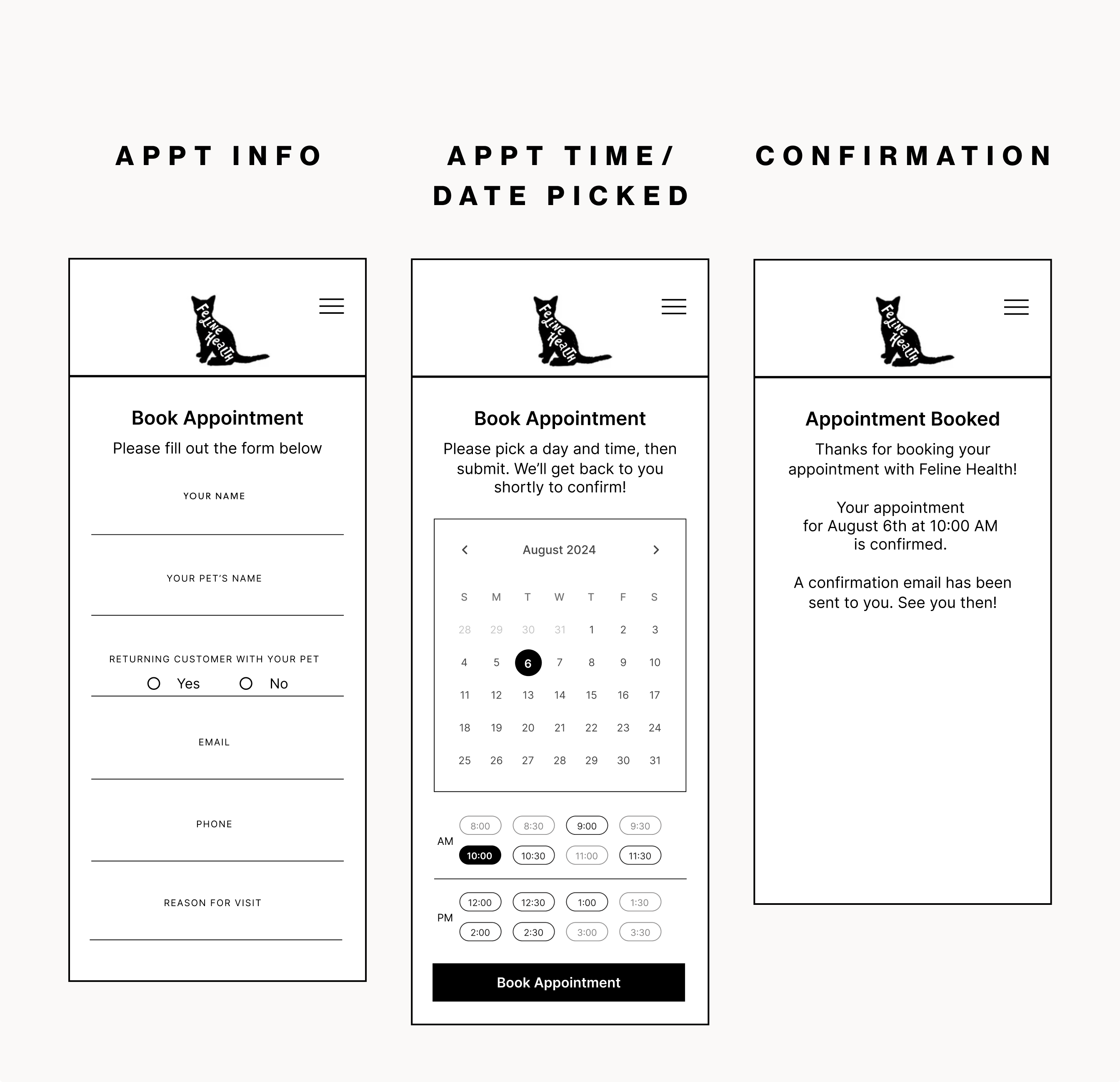
The flow begins on the homepage, where users can choose how to book: by email, phone, or through an online calendar. In the improved experience, the calendar leads them step by step—selecting a date, choosing a time slot, and confirming the visit. Each step highlights the most important details and allows users to review or go back before finalizing. The goal was to make scheduling feel simple, reliable, and as straightforward as talking to the clinic directly—without the delays or errors.
user flow
I tested low fidelity with wireframes with five participants to validate the appointment booking flow — selecting a date, choosing a time, and confirming the visit. 100% of users completed the tasks successfully and rated the process easy to follow. Overall satisfaction was 84%, lowered by feedback that contact details weren't always visible when participants wanted to review information during the flow.
low fidelity desktop
low fidelity mobile
Design
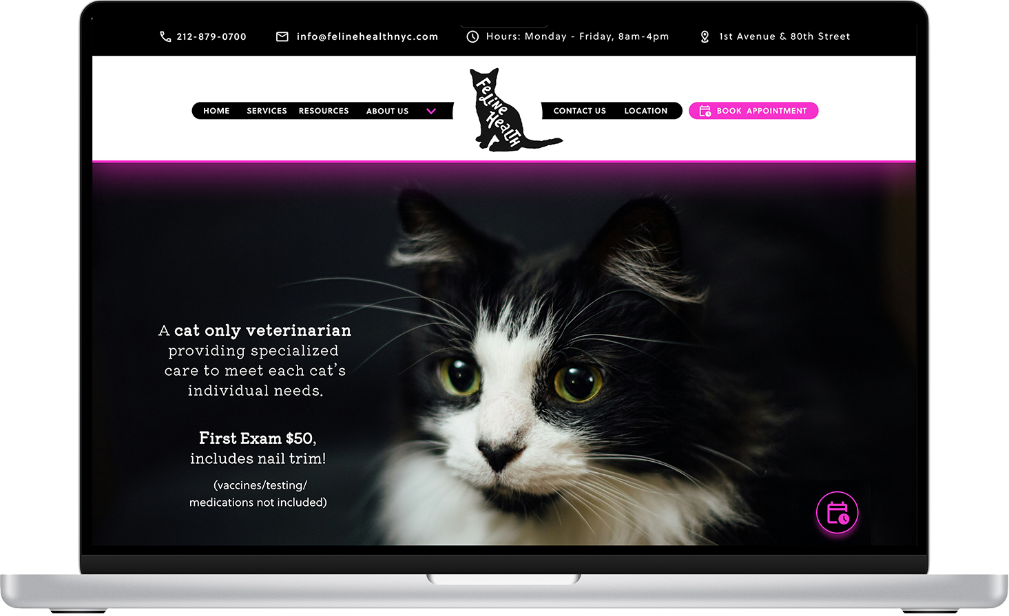
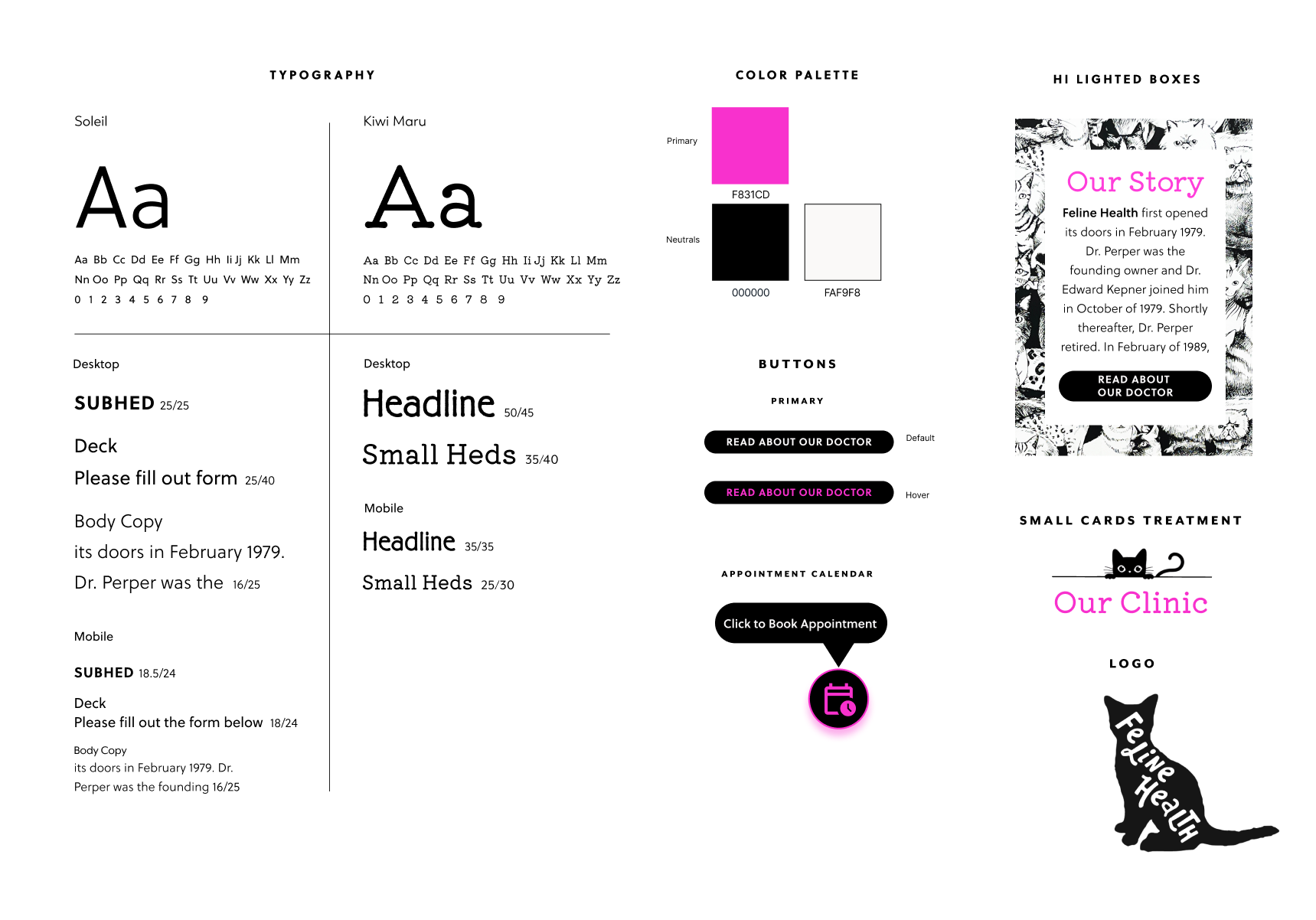
I refined typography, colors, and UI elements to modernize the site while staying true to Feline Health's playful spirit. A refreshed logo created cohesion, while neon pink accents echoed the clinic's interiors and added energy. Consistent use of type, buttons, and iconography built clarity and trust, with subtle touches highlighted boxes and cards adding personality without clutter. The result is a site that feels as welcoming online as the one-doctor practice does in person.
branding
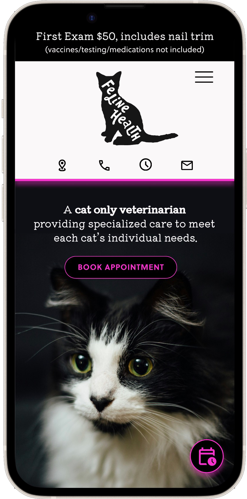
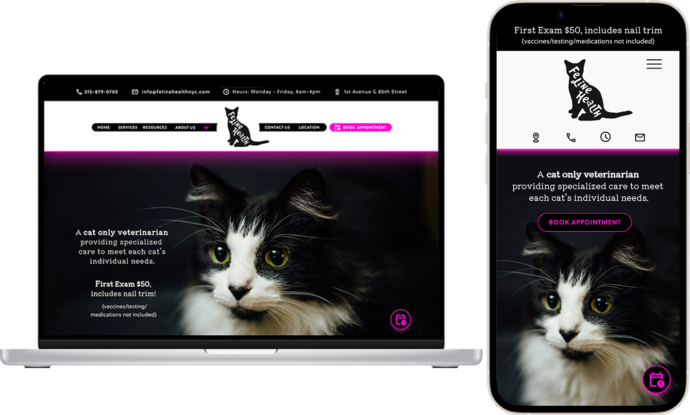
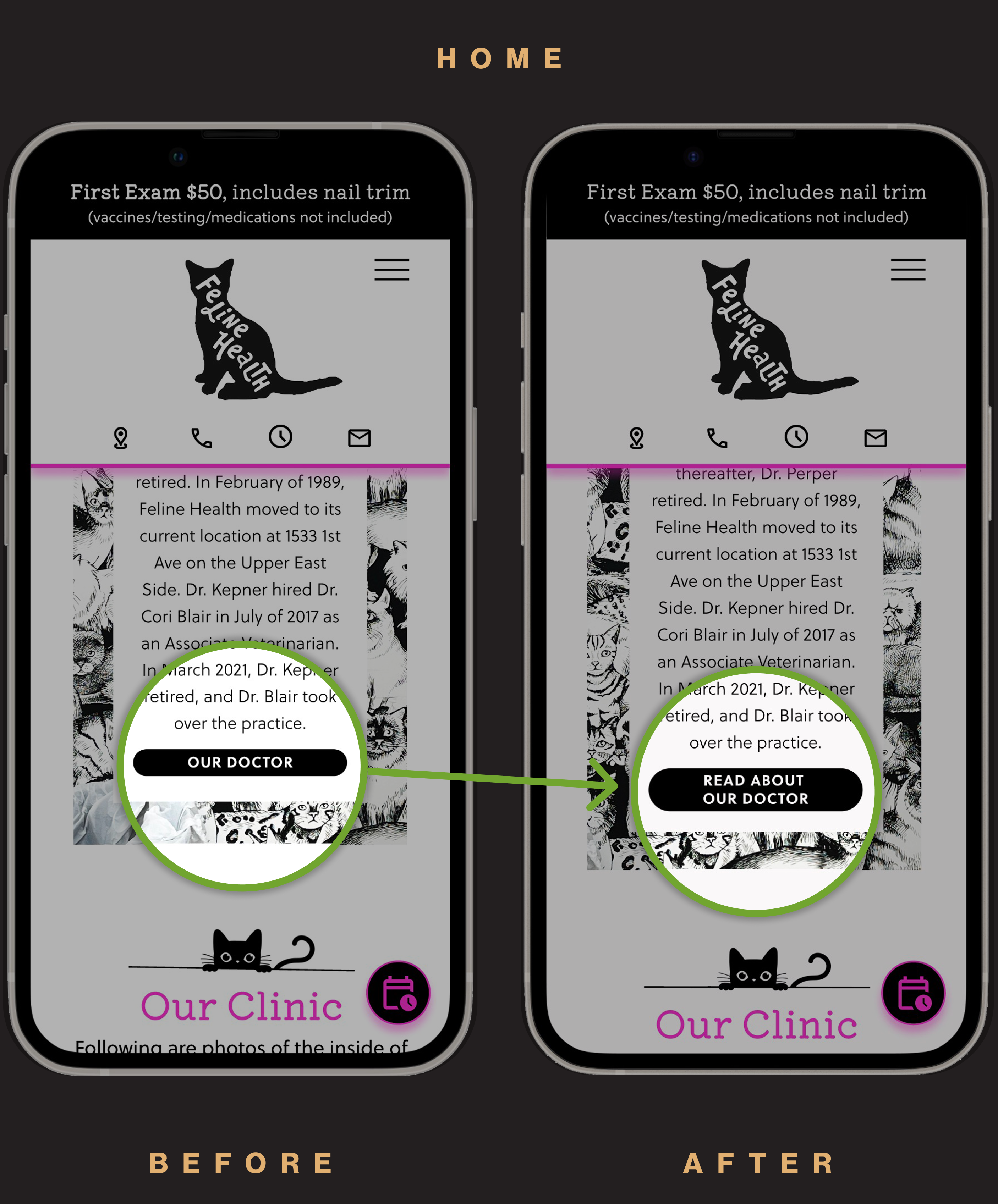
High fidelity wireframes translated the validated flow into a fully realized experience that balanced the clinic's personality with user needs. I streamlined navigation so hours and contact details were always accessible, and redesigned the appointment button to stand out more on mobile. Layout and hierarchy were adjusted to guide users with less effort, while consistent typography and neon-inspired accents carried the clinic's playful atmosphere online.
high fidelity desktop
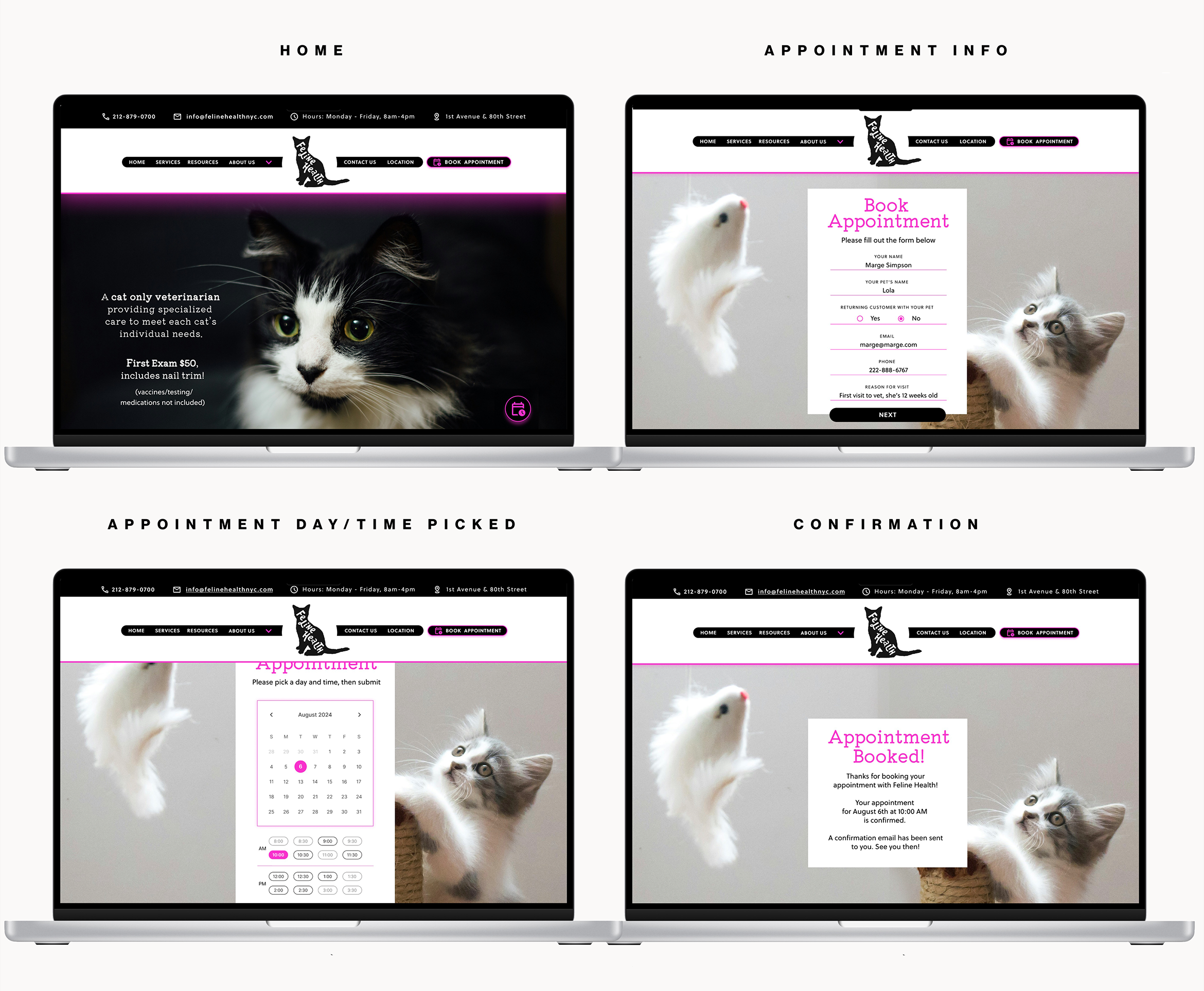
high fidelity mobile
Testing
I conducted usability testing with five participants to evaluate the redesigned booking flow. All participants completed the process without errors, and satisfaction rose to 92% after improvements to navigation and mobile usability. Participants found clinic details easier to access and the appointment button clearer on mobile. Feedback also pointed to the need for an emergency number in the footer, which guided the final refinements to improve access to critical information.
iterations desktop
A) Changed book appointment link to pink
B) Added prompt to show calendar icon "Click to Book Appointment" on hover
Changed After Hours Emergency information to a 24/7 emergency vet clinic
Changed user options to only show available time slots
iterations mobile
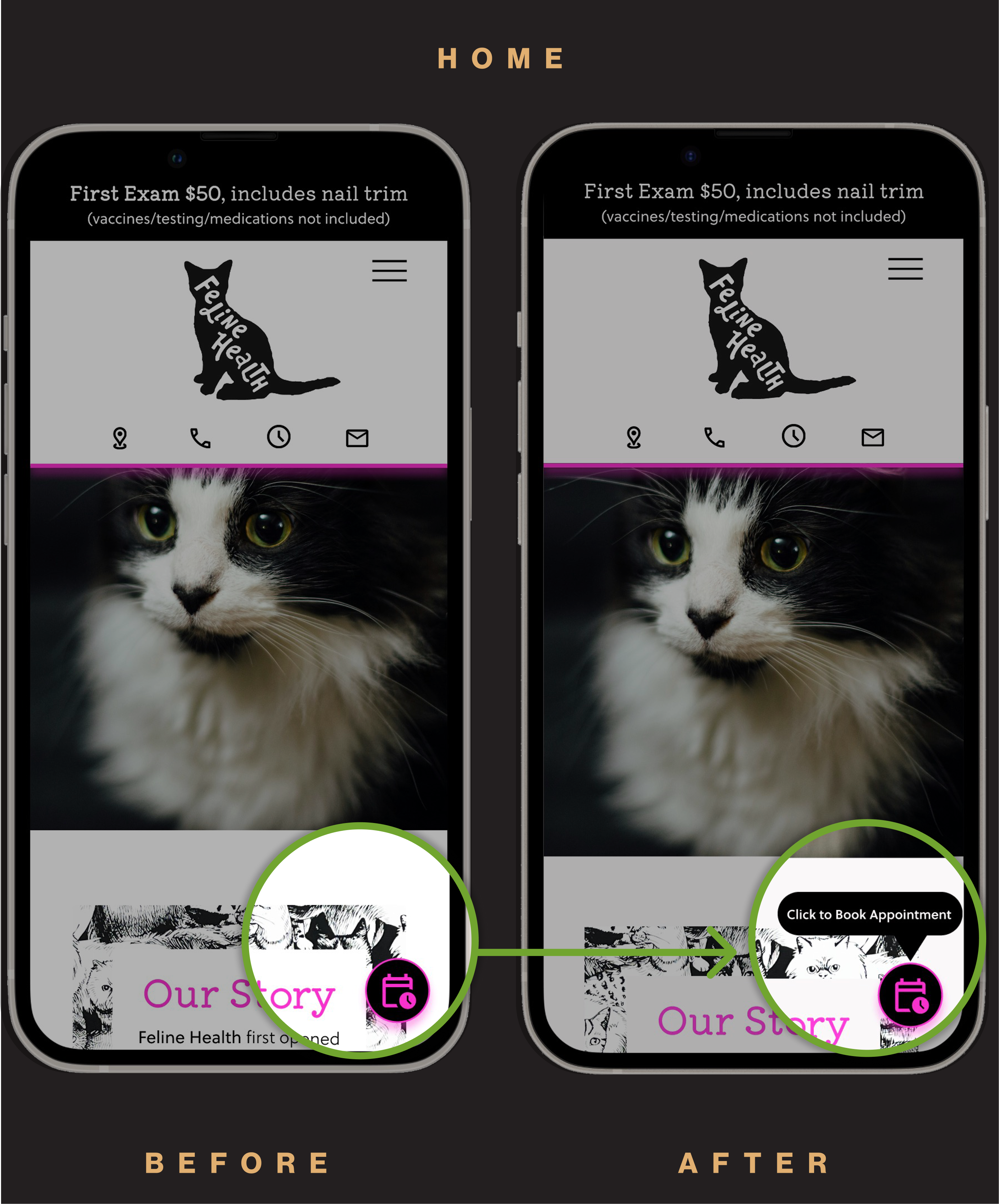
Added prompt to show calendar icon "Click to Book Appointment" on hover
Changed all button heights to 40px for ease of use
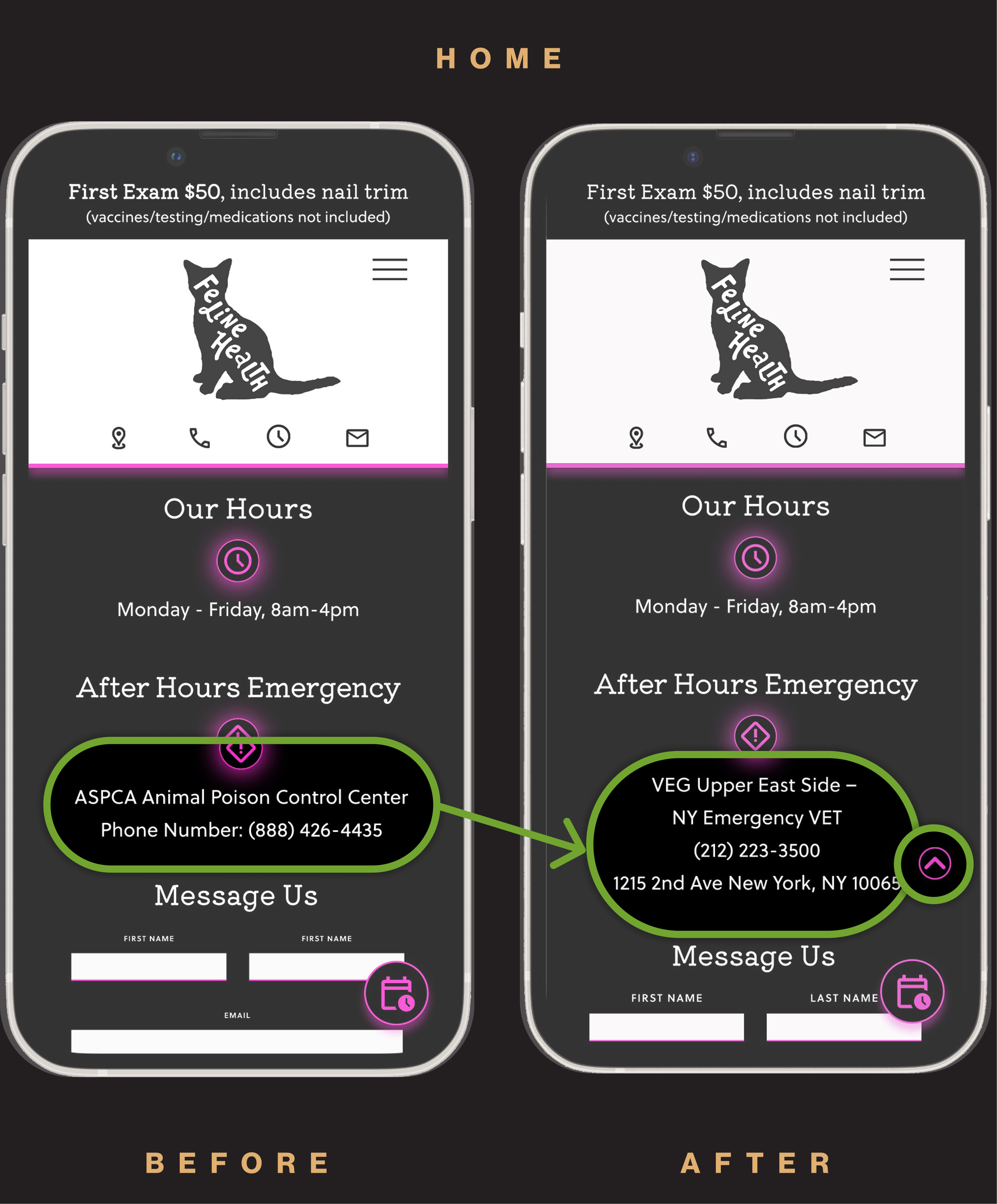
Changed After Hours Emergency information to a 24/7 emergency vet clinic and added Scroll to Top button