The New York Times Cooking App
A concept project adding a serving size adjustment feature to the NYT Cooking app, improving recipe accuracy, grocery lists, and meal prep.
problem
The app lacks a serving size adjustment feature, making it difficult for users to scale recipes accurately. This leads to errors, inconsistencies, and confusion during meal prep. Without automatic updates to grocery lists and nutritional info, the experience feels incomplete.
solution
I designed a serving size adjustment feature that automatically recalculates ingredients, cooking times, instructions, and grocery lists in real time — ensuring recipe accuracy and improving the overall cooking experience.
project
Add a Feature
role
UX Researcher
UI Designer
duration
4 Weeks
tools
Figma
Photoshop
Research
I started by looking at how recipe platforms approached serving size and meal planning. Some offered dynamic adjustments with grocery integrations, while others only allowed scaling at the ingredient level. Many leaned on video content or large recipe libraries but lacked flexibility for real-world cooking needs. From this, I saw an opportunity for NYT Cooking to blend its trusted editorial voice with tools that empower users—like serving-size adjustment and smarter grocery support.
competitive analysis

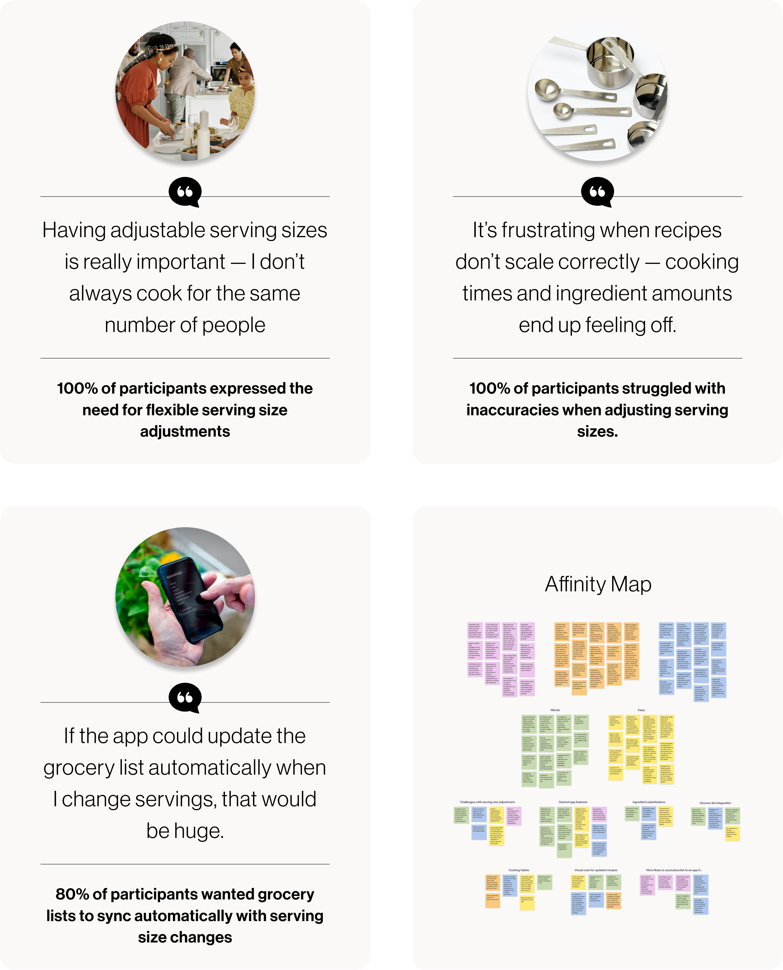
To explore how home cooks interact with recipe scaling, I ran five moderated research sessions and organized feedback into an affinity map. Clear patterns emerged: users valued accurate recipe adjustments, expected grocery lists and nutritional data to update automatically, and looked for visual cues to build confidence. They also wanted flexibility for batch cooking or smaller portions, and emphasized that scaling should be fast, intuitive, and time-saving—insights that guided the feature design.
affinity mapping
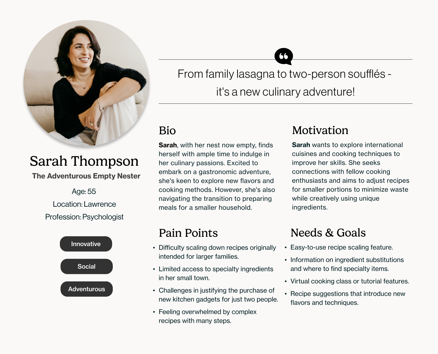
Sarah is an empty nester embracing her newfound time to explore cooking as a creative outlet. She seeks tools and inspiration that make scaling recipes, discovering unique ingredients, and learning new techniques both seamless and enjoyable.
persona
Define
Through user research and affinity mapping I identified three priorities:
1
Flexible Serving Sizes
Give users more control by letting them adjust recipes to match their household size, reducing food waste while making cooking more approachable.
2
Integrated Updates
Users wanted serving-size adjustments to connect seamlessly across the experience — from ingredients to grocery lists to nutrition. This integration made cooking easier, reduced errors, and built trust in the tool.
3
Intuitive Interface
Precision alone wasn't enough; the feature also had to feel effortless. Simple controls, clear visual cues, and real-time updates gave users confidence and encouraged them to experiment.
These insights helped define the goals, which I represented visually using a Venn diagram.
venn diagram

Ideate
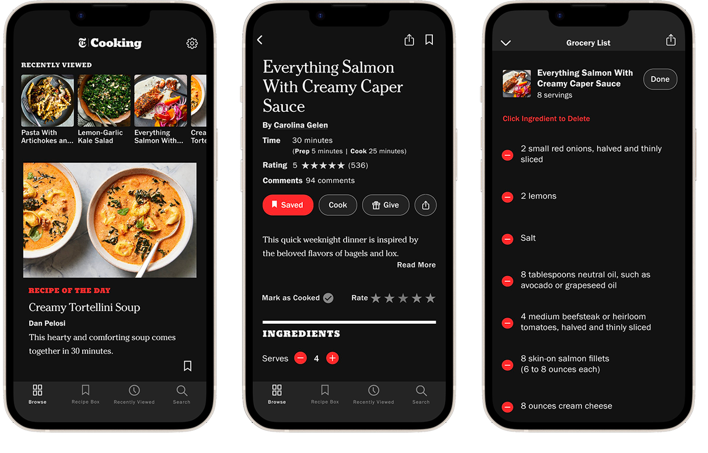
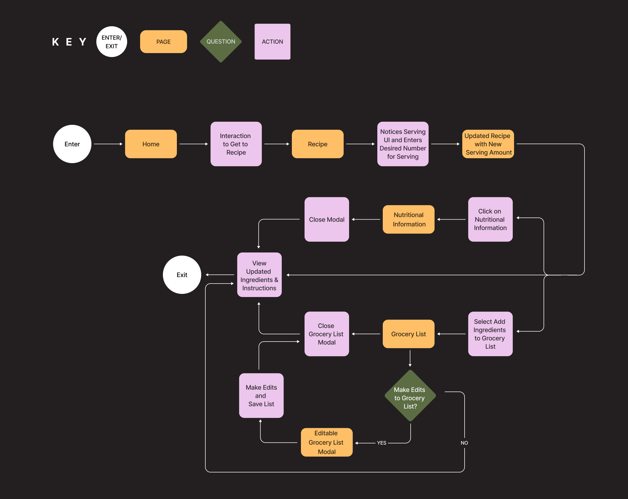
I mapped the journey from the homepage into a recipe, through serving size adjustment, and into tools like grocery lists and nutritional information. The flow emphasizes intuitive serving adjustments with quantities updating instantly, while giving users the option to edit a grocery list or view nutrition before returning to the recipe. The goal was to reduce the friction of manual recalculation and ensure every change in servings carried through seamlessly.
user flow
I tested low fidelity wireframes with 5 participants to validate the user flow — adjusting a recipes' serving size and checking the grocery list. 100% of users completed the tasks successfully and rated the flow easy to use. Overall satisfaction was 88%, lowered by the fact that in the existing NYT UI, participants couldn't edit the grocery list (for example, adding an extra lemon to the items).
low fidelity
Design
Building on the low fidelity feedback, I refined the grocery list interface by enlarging and moving the Edit/Done controls and aligning the deletion pattern with NYT's existing UI. I then tested the hi fi prototypes with 6 participants. 93% were satisfied with the serving size adjustment, praising the clear +/− controls. Grocery lists scored 87%, and overall usability 87%. Participants still wanted inline editing to add or change items directly, but this functionality was beyond the project scope.
high fidelity wireframes
Testing
Six users tested the high-fidelity prototypes, and the results were strong. Satisfaction with the serving size adjustment feature reached 93%, with participants praising the clarity of the red +/- buttons. Grocery lists scored 87%, though users requested inline editing, which was outside the project's scope. Overall usability was rated at 87%, with the design aligning well to the NYT brand identity. The main feedback was to allow single-unit increments rather than adjustments of two.
iteration
Before the feature increased/decreased by 2 from 2 to 8 serving sizes
Now the feature increases/decreases by 1 from 1 to 8 serving sizes
view prototype