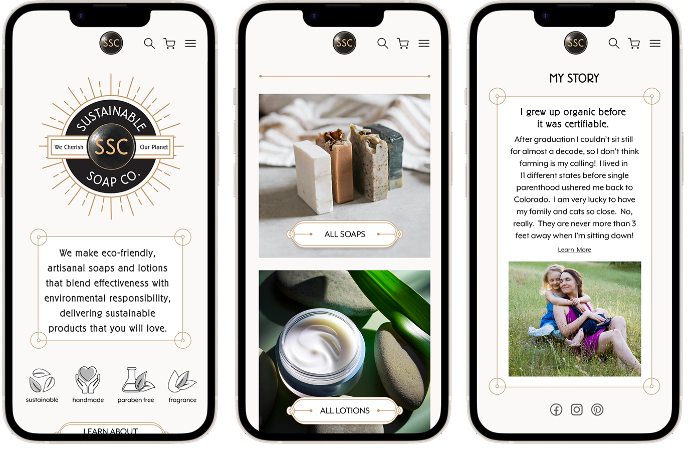
Sustainable Soap Co.
End-to-end redesign of my niece's e-commerce site, a small-batch brand making eco-friendly soaps, shampoos, and lotions — highlighting sustainability and a seamless shopping experience.
problem
The original site looked generic and failed to communicate the sustainable ethos. Traffic was low, customer engagement was weak, and visitors weren't converting into buyers. Without a strong brand identity or clear transparency, the website wasn't trust.
solution
The redesign should convey my niece's brand—authentic, modern, and rooted in sustainability—while reinforcing transparency and trust. By highlighting small-batch products, sharing the brand story, and making sustainability proof easy to access, the goal is to deepen customer connection and foster long-term loyalty.
project
End to End Mobile
Redesign
role
UX Researcher
UI Designer
duration
12 Weeks
tools
Figma
Photoshop
Research
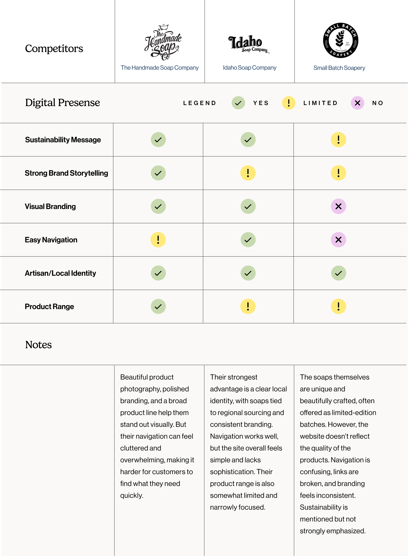
I began by analyzing sustainable e-commerce sites to understand how small-batch brands were presenting themselves online. I noticed some leaned on convenience and scale, while others focused on artisanal storytelling or eco-certifications. What stood out was the lack of balance between brand authenticity and shopping usability. That insight shaped the opportunity for SSC: a site that feels true to its roots while making sustainability proof easy to access.
competitive analysis
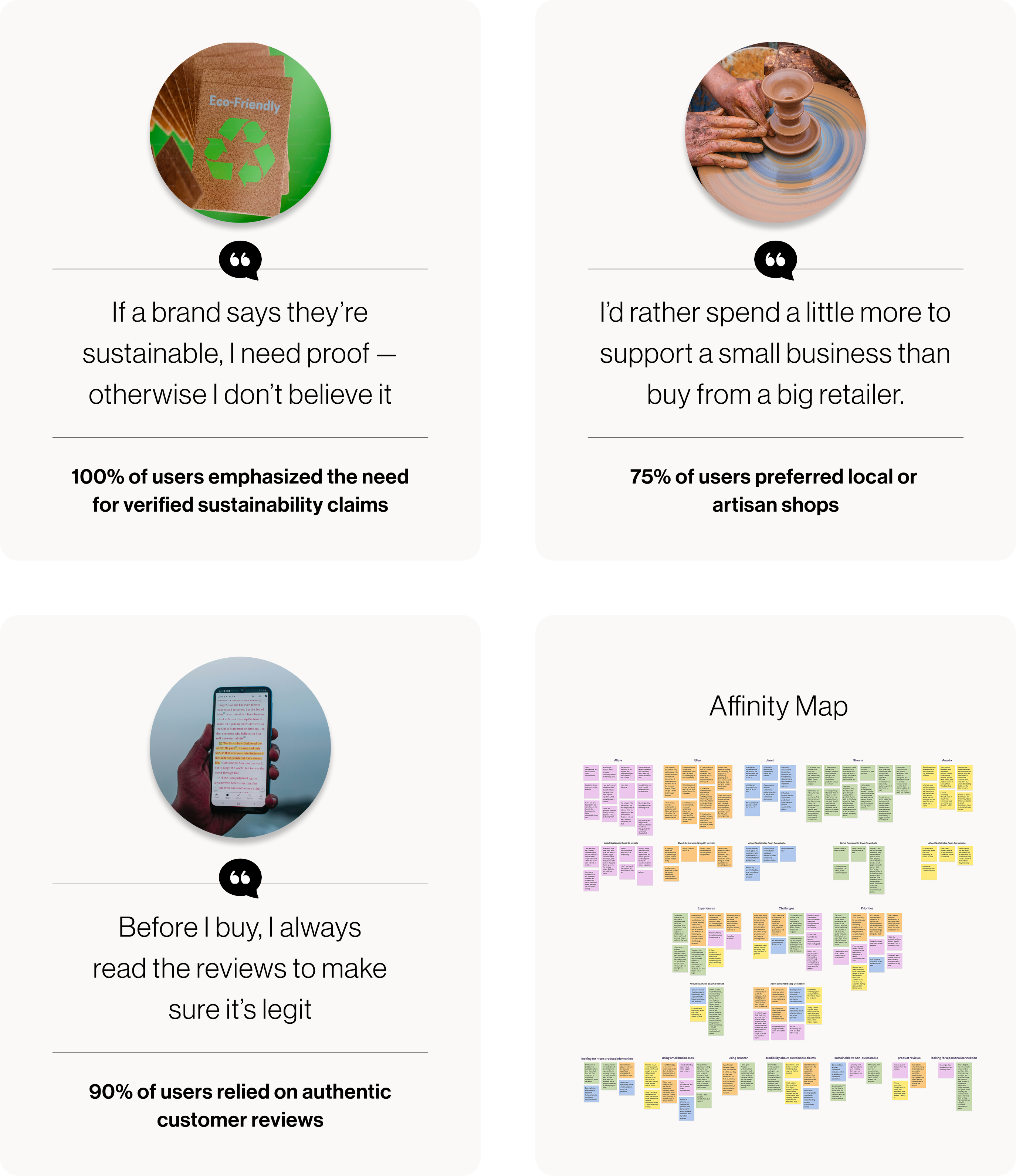
To understand user motivations and shopping behavior, I conducted five interviews and organized feedback into an affinity map. Clear patterns emerged: users wanted proof of sustainability, preferred small/local businesses, and relied heavily on authentic reviews—insights that guided key design decisions.
affinity mapping
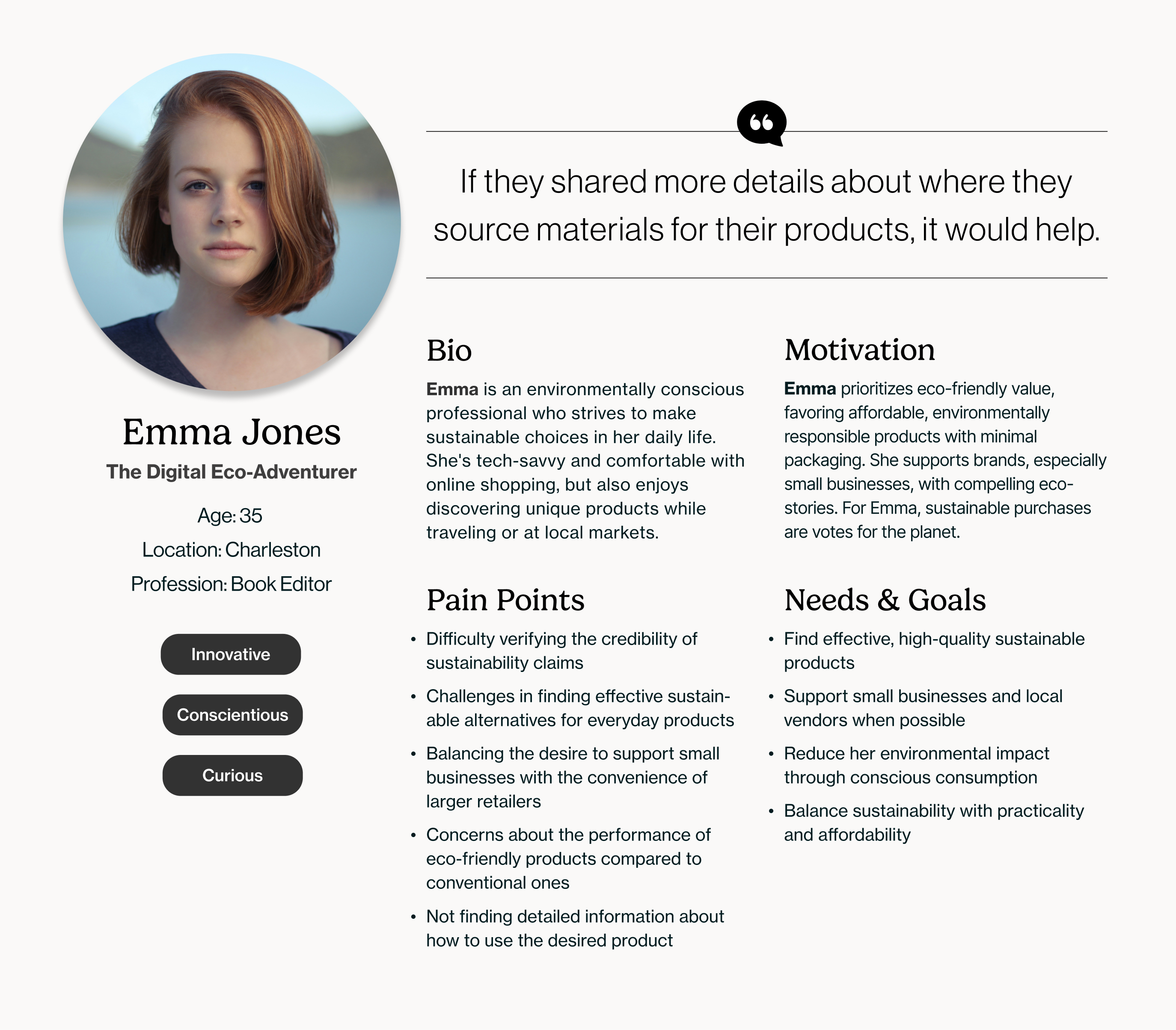
Emma represents the insights from my research: an eco-conscious, research-driven shopper who values small-batch brands and expects both quality and convenience. She highlights the need for better transparency in sustainable shopping, since she won't commit without clear proof of sustainability.
persona
Define
After identifying users' core needs, I distilled insights into three priorities:
1
Trust in Sustainability
Showcase certifications, eco-proof, and sustainable practices in clear, visible ways so customers feel confident that their purchases align with their values.
2
Transparent Details
Provide straightforward information about product ingredients and usage, making it easy for customers to understand what they're buying while reinforcing the brand's eco-friendly mission.
3
Seamless Shopping
Streamline navigation, highlight authentic reviews, and emphasize branding to create a smooth, engaging experience that feels both convenient and personal, like shopping at a local market.
Ideate
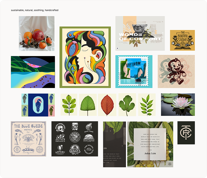
To set the visual direction, I created a mood board that blended the brand's Art Deco roots with clean, natural visuals. Earthy tones and ingredient-focused imagery signaled sustainability, while clean layouts and authentic textures built a sense of trust. Together, these elements defined the typography, color, and imagery that carried through the redesign.
mood board
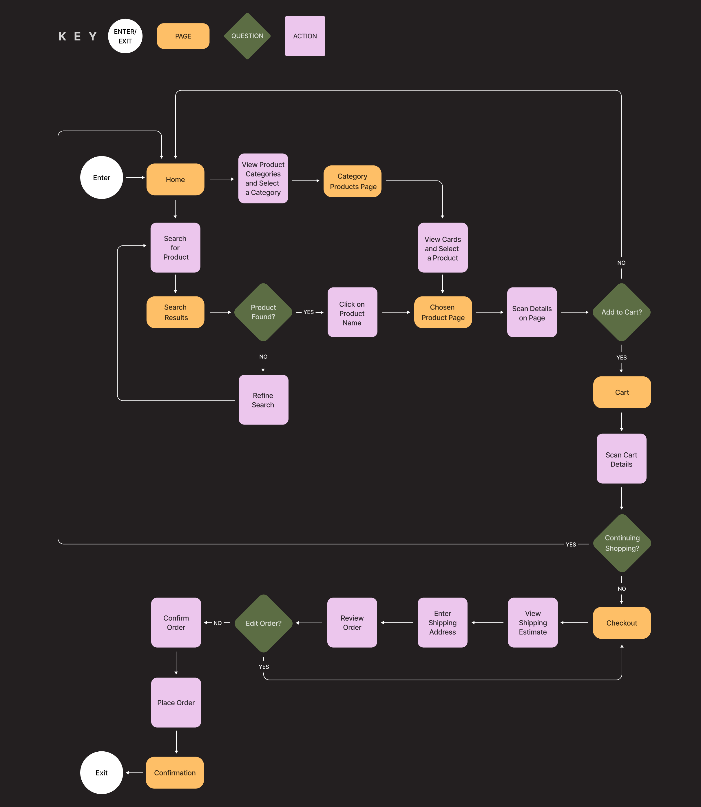
I mapped the key journey from homepage → product discovery → checkout. The focus was on simplifying decisions and making sustainability info and reviews easy to find.
user flow
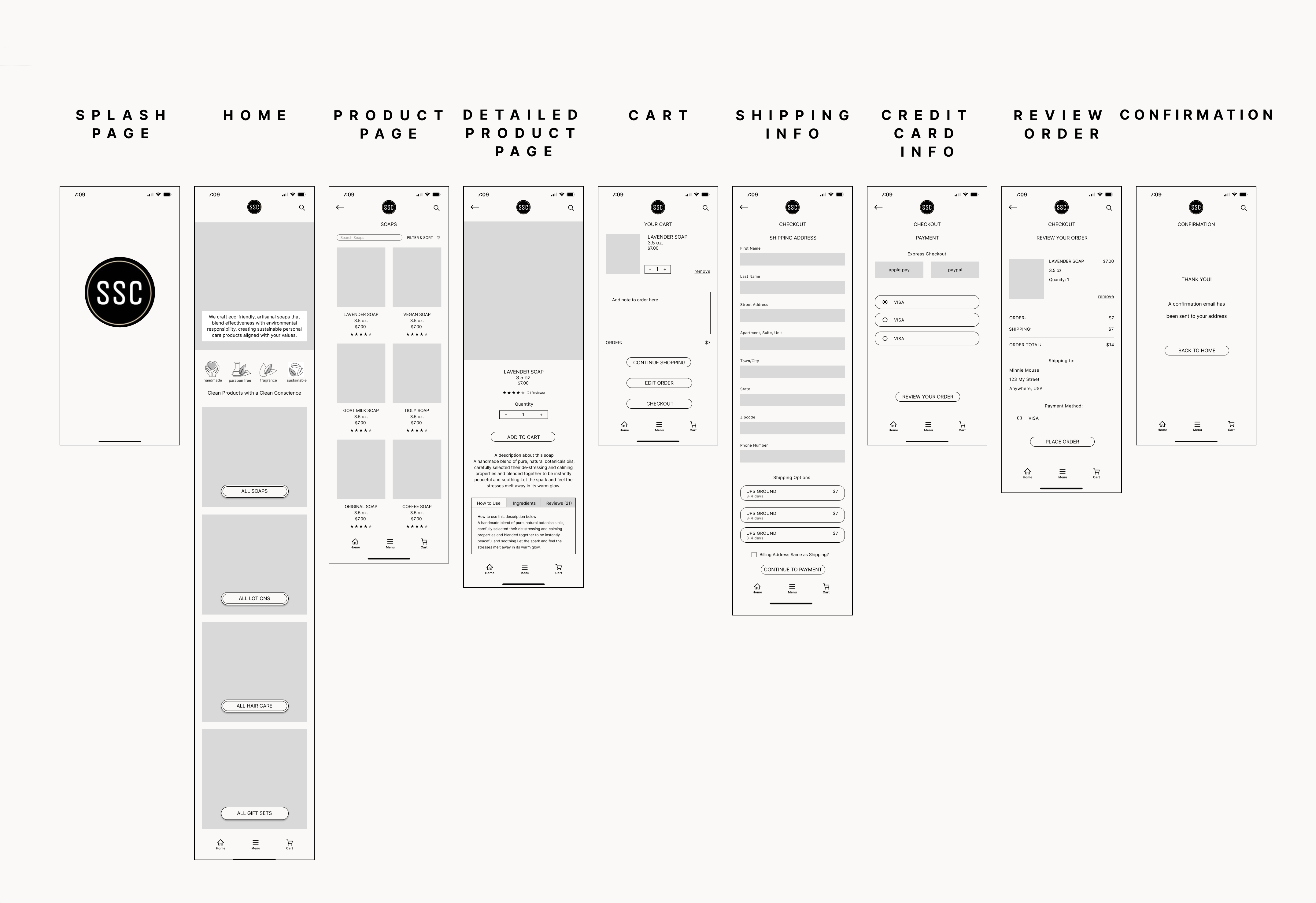
I created low fidelity wireframes in Figma and ran moderated testing with 5 participants. Their tasks included exploring the homepage and purchasing the vegan soap. 100% of participants completed the tasks without errors and found the navigation intuitive, though they suggested enlarging the hamburger menu and making product reviews easier to access.
low fidelity
Design
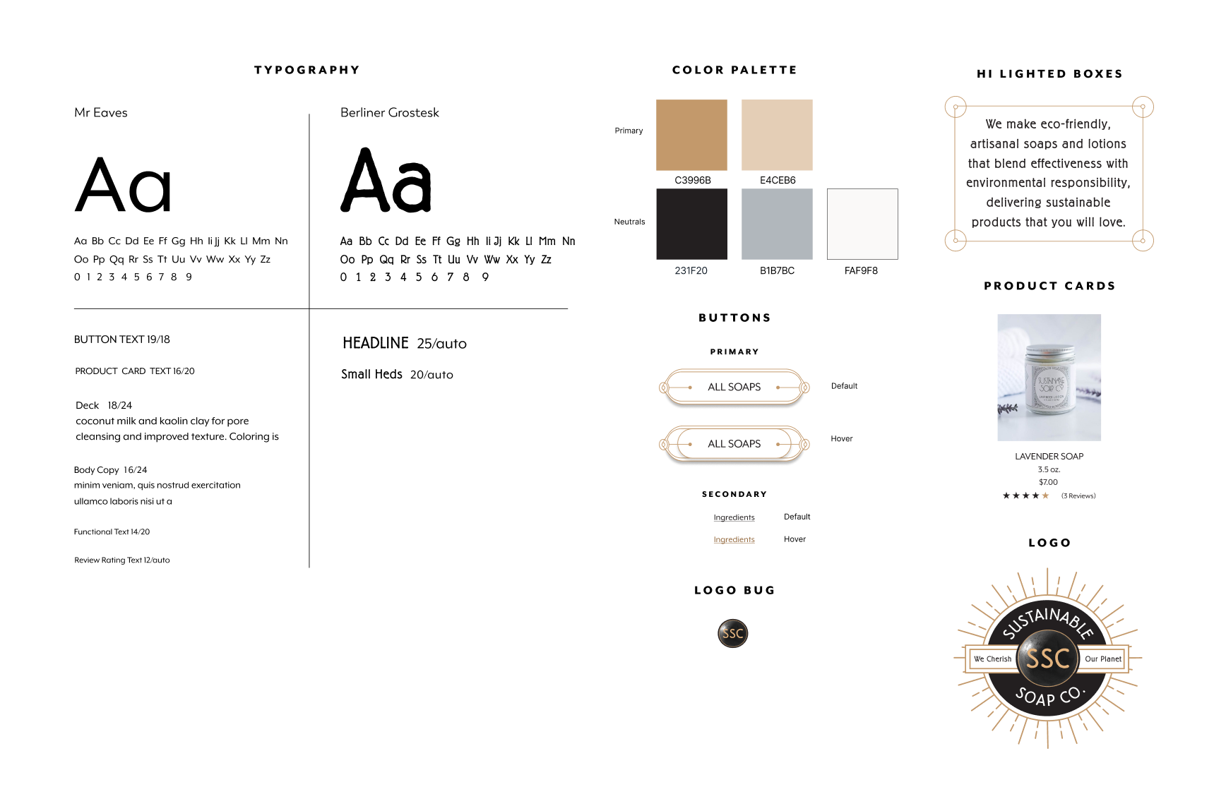
I refined typography, colors, and logo lockups to modernize the look while keeping the brand's Art Deco character intact. I also created a new logo that worked seamlessly with existing brand assets, making the identity feel updated without losing recognition. A muted, nature-inspired palette reinforced sustainability, while consistent use of type and iconography built trust through clarity and cohesion. Together, these system elements ensured the redesigned site felt both authentic to the brand and seamless for the user.
branding
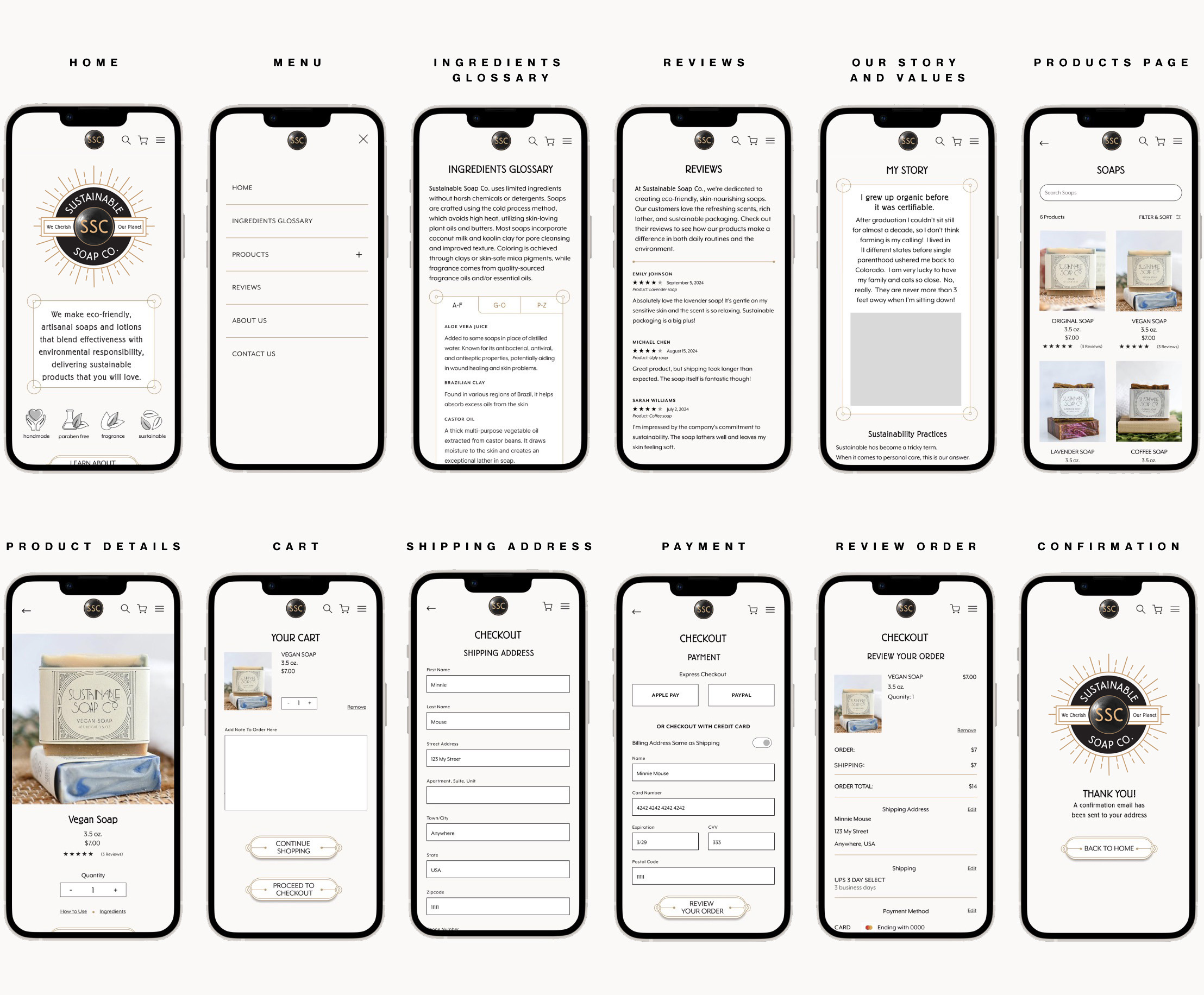
In Figma, I translated the design system into high fidelity wireframes that unified the brand story with user needs. Navigation was expanded for clarity, a dedicated sustainability section and ingredient glossary were added, and a standalone reviews page highlighted authentic feedback.
The checkout flow was simplified into a two-step process (shipping → payment), followed by order review and confirmation. Progress indicators, cleaner forms, and express options like Apple Pay and PayPal made checkout faster and easier for users.
high fidelity wireframes
Testing
Moderated usability testing with 5 participants validated the redesign. Every participant rated the site 5/5 for usability, with scores of 98% for ease of use and 100% for checkout flow. While the purchasing process felt seamless, participants noted that sustainability information still needed more depth. Based on this, I planned refinements to strengthen transparency and clarity.
Moving forward, I implemented several iterations to improve clarity and flow. Homepage icons now link to dedicated values sections, navigation was expanded, a cart page and empty state were added, and design details like button styles, field strokes, and subheads were standardized. These updates made the site feel more consistent and user-friendly.
iterations
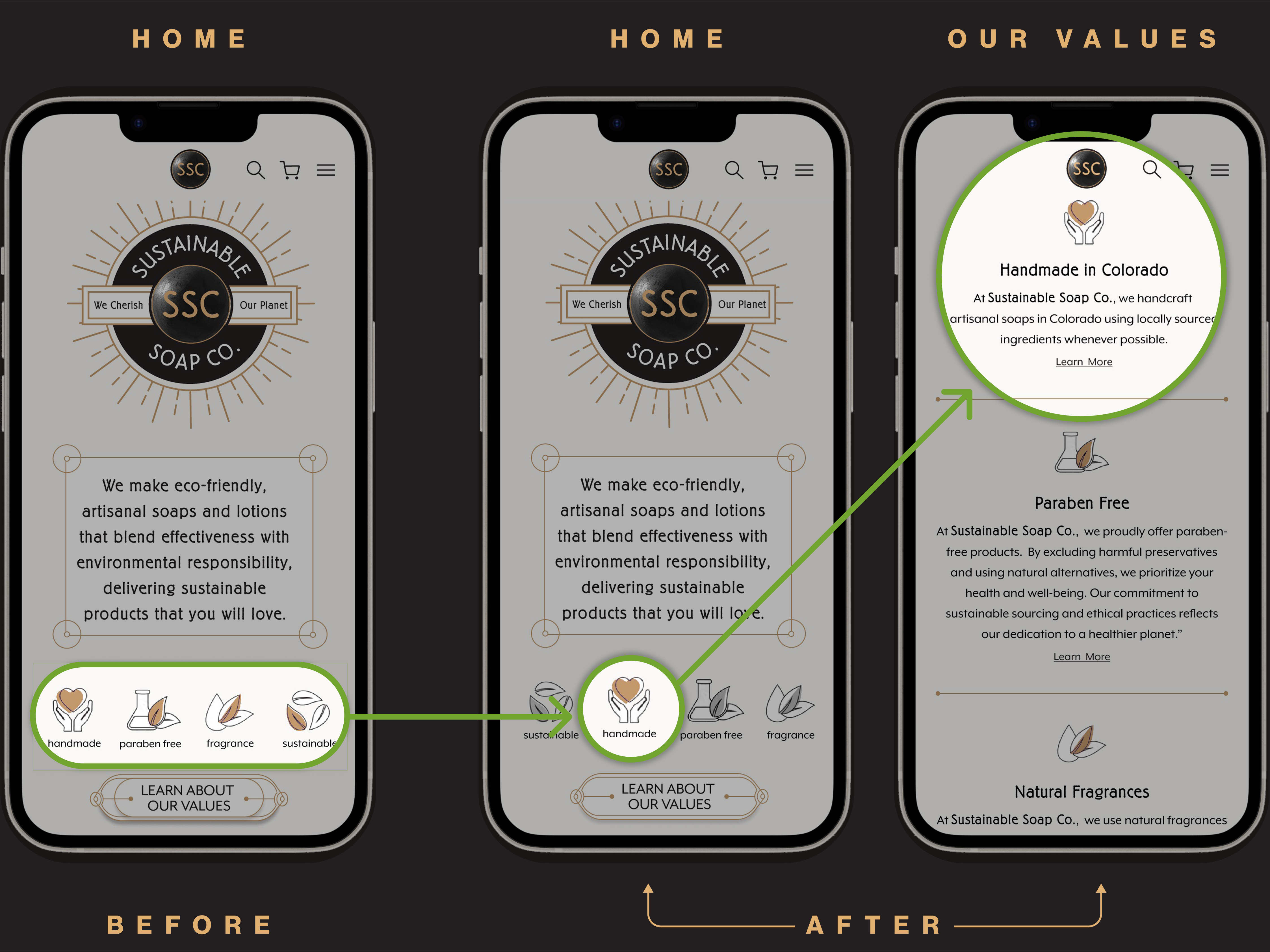
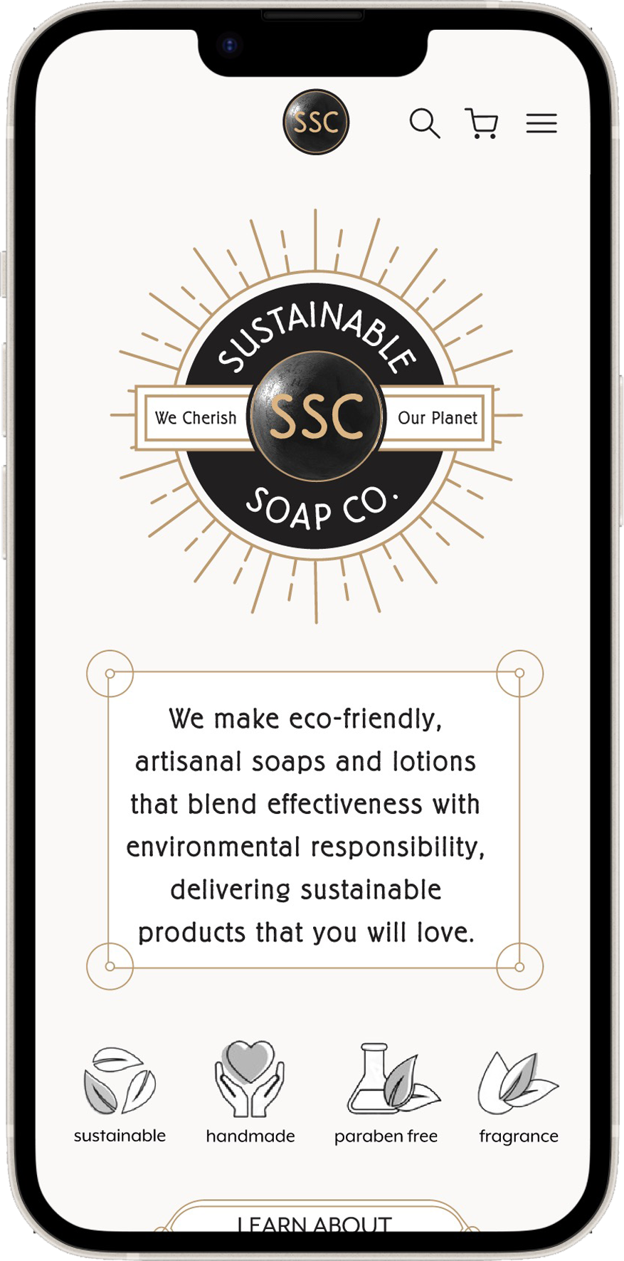
Each icon goes to it's own section on Our Values page when clicked
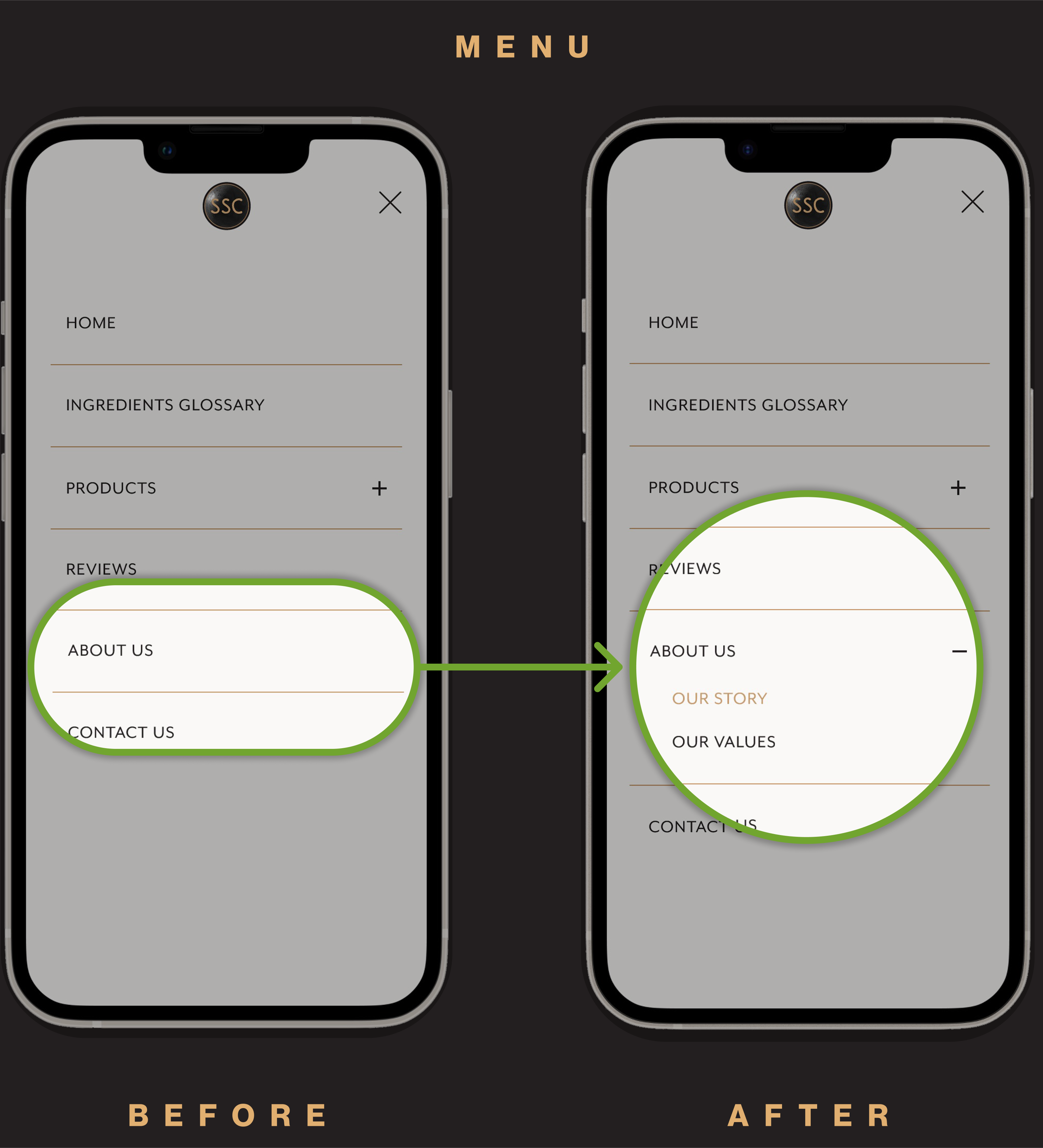
About Us navigation expanded into a drodown with two subpages
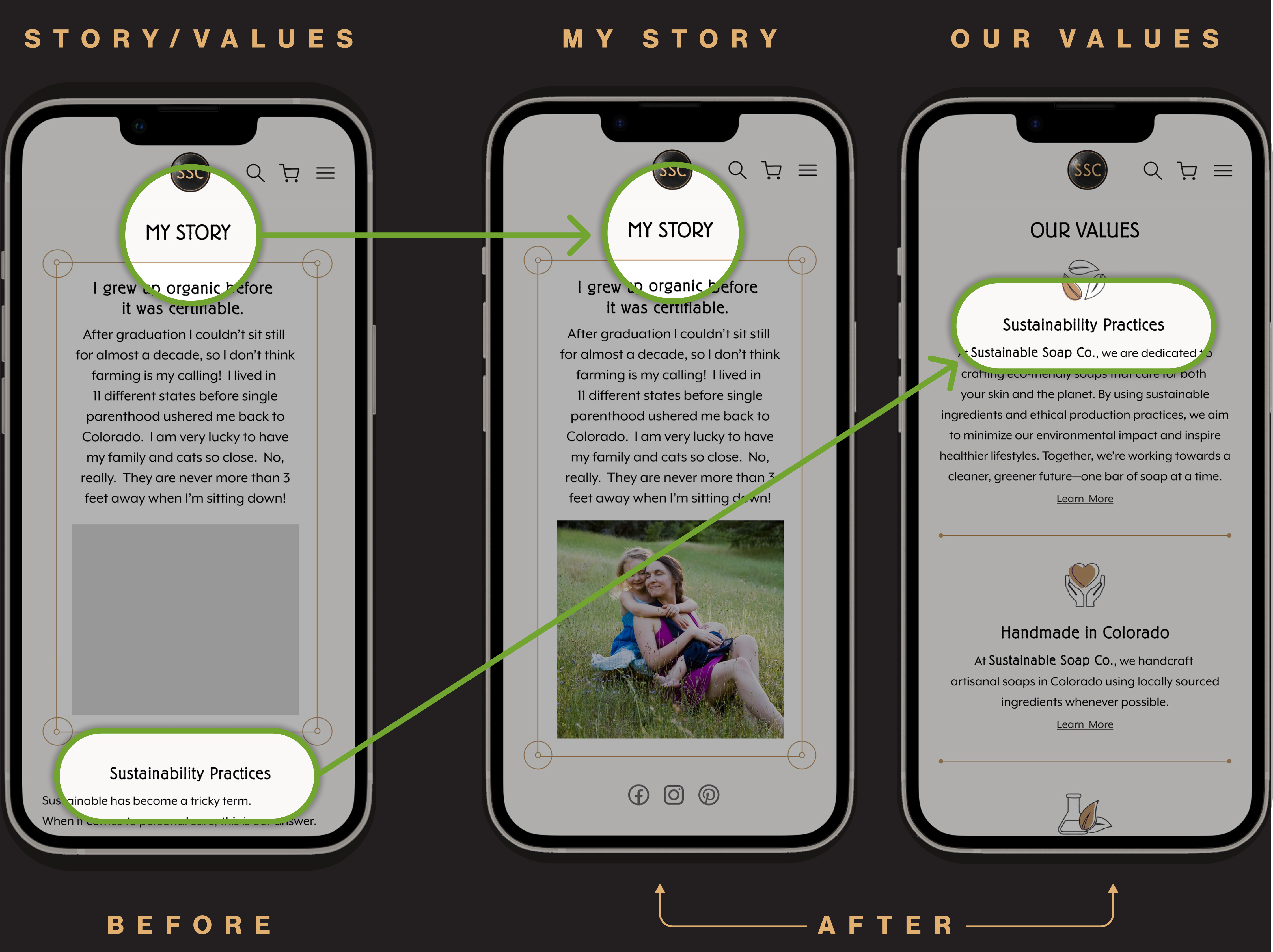
My Story and Our Values are now separate pages, with social links on My Story and "learn more" links on Our Values
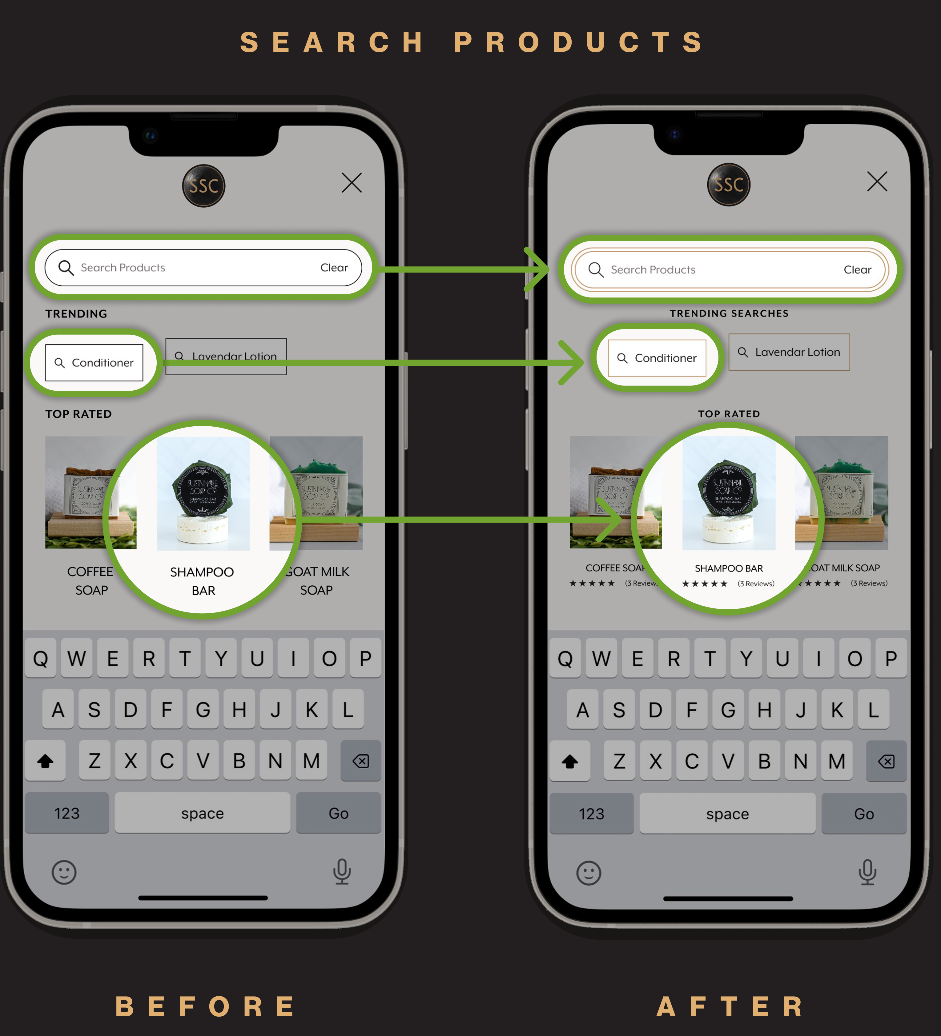
Search field restyled, trending labels refined, and product cards updated for consistency
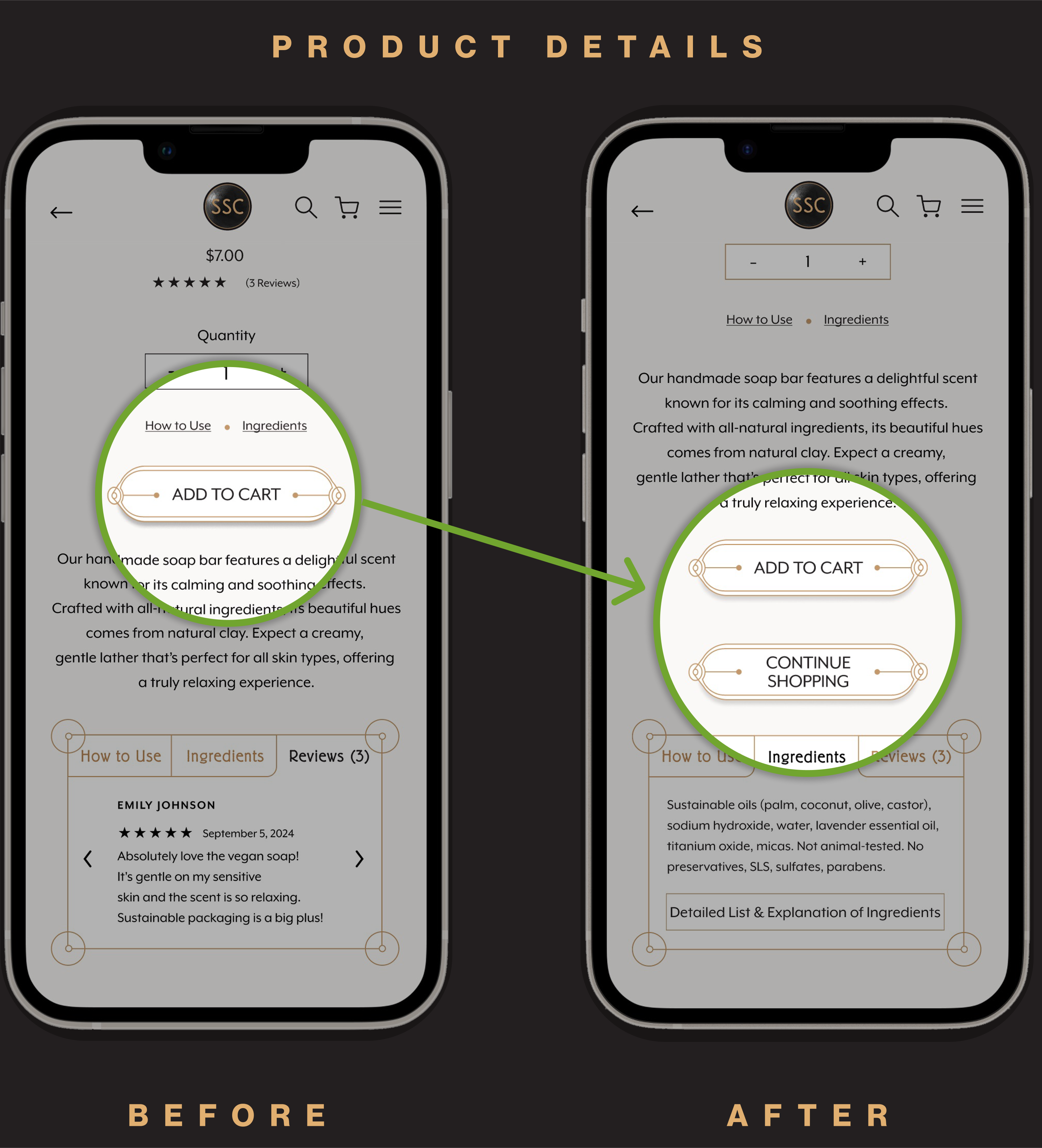
Continue shopping button added to Product page for smoother browsing
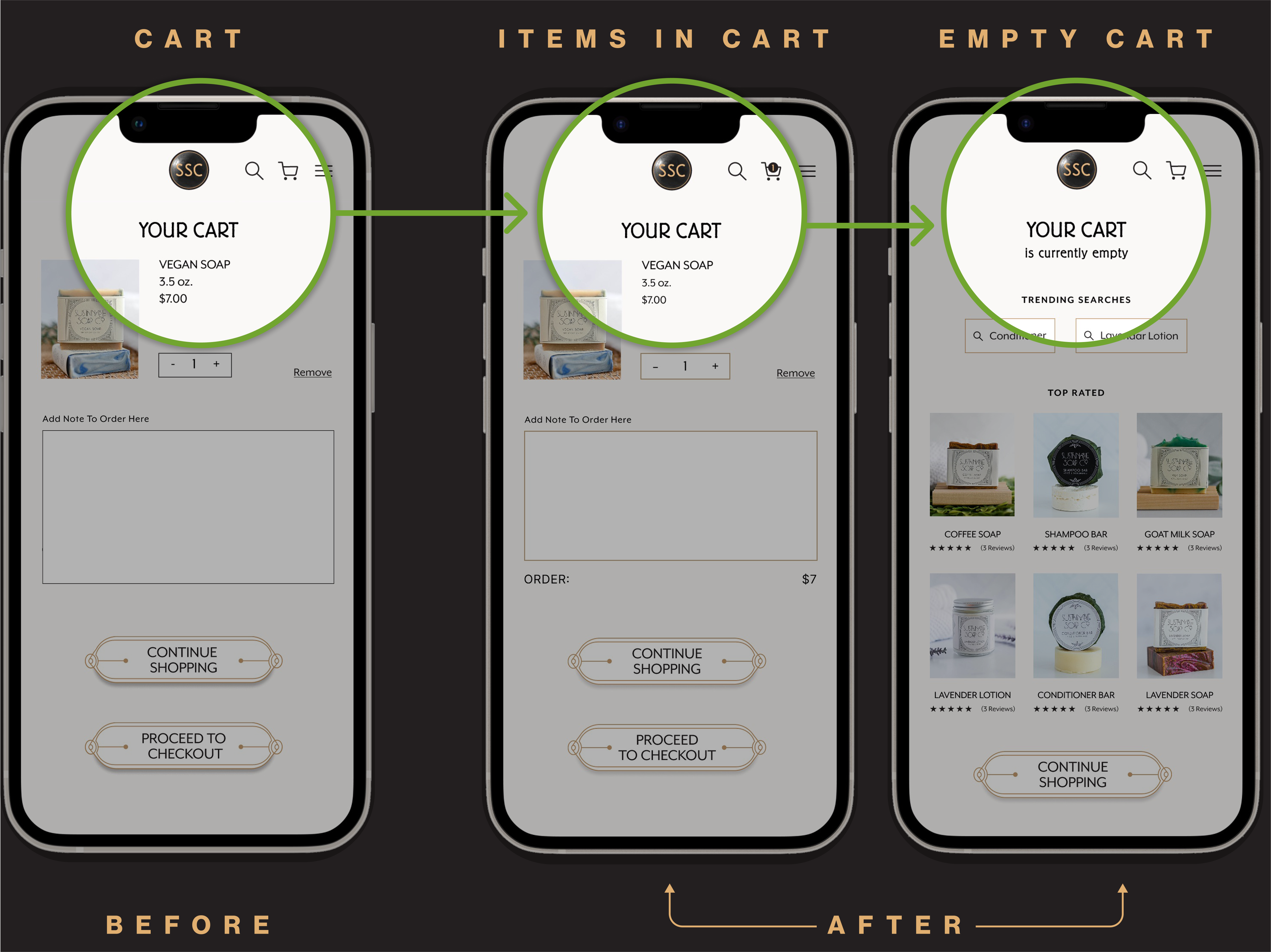
Added item count indicator and empty cart state
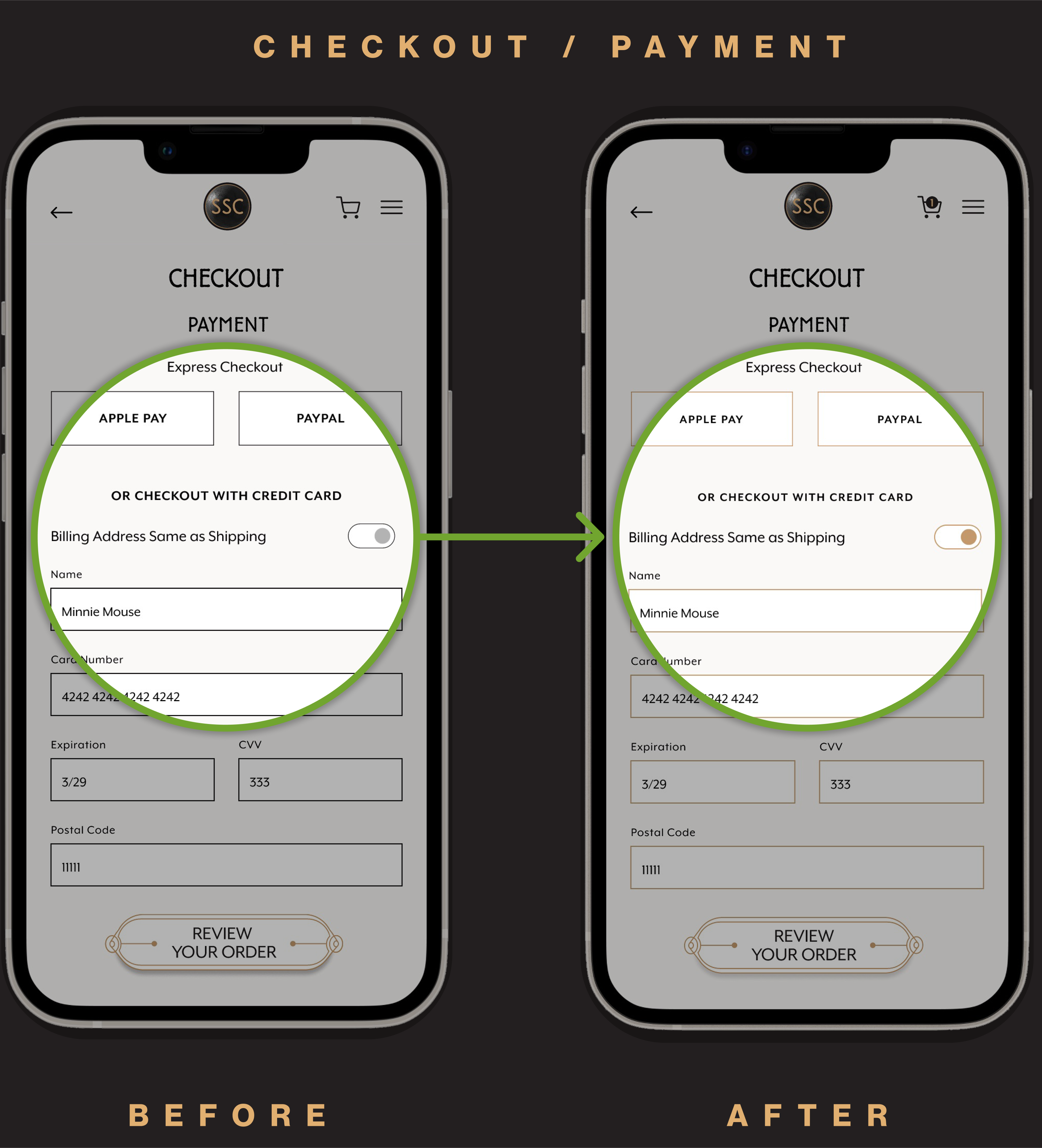
Input fields restyled with gold strokes for consistency
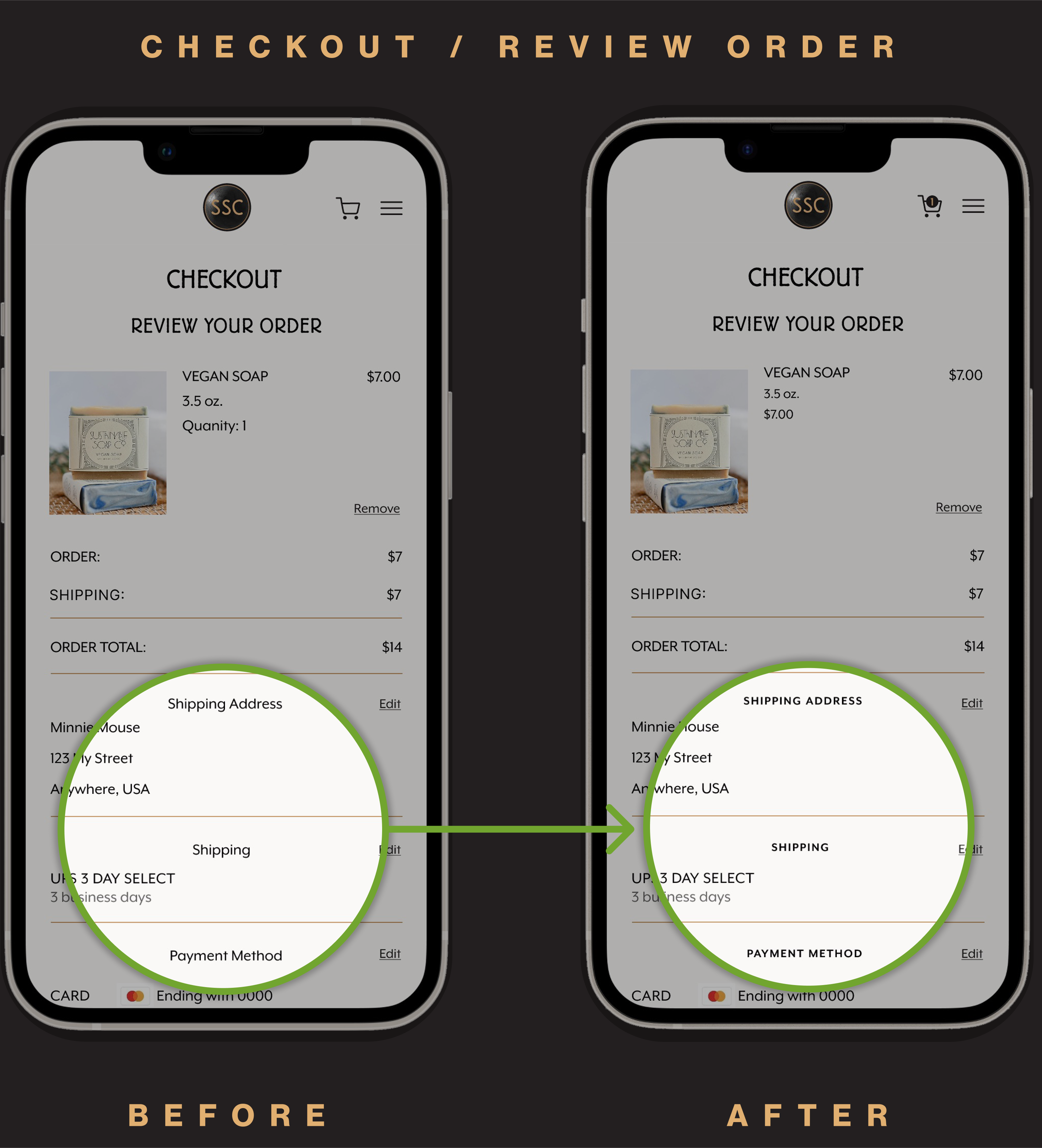
Subheads update for consistent hierachy and clarity
view prototype